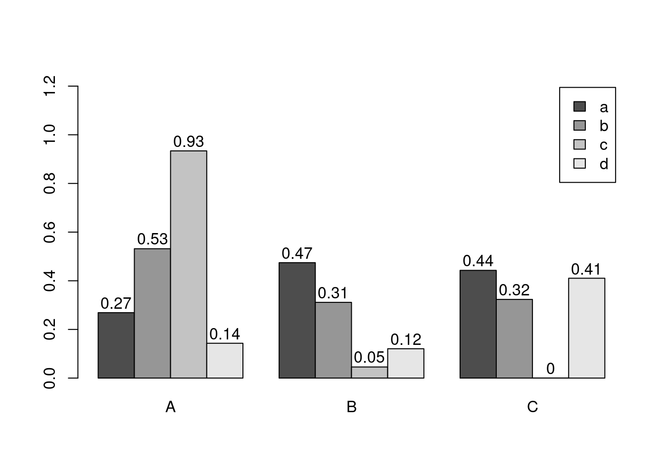
           A          B            C
a 0.26904539 0.47439030 0.4427788756
b 0.53178658 0.31128960 0.3233293493
c 0.93379571 0.04576263 0.0004628517
d 0.14314802 0.12066723 0.4104402000
e 0.57627063 0.83251909 0.9884746270
f 0.49001235 0.38298651 0.8235850153
g 0.66562596 0.70857731 0.7490944304
h 0.50089252 0.24772695 0.2117313873
i 0.57033245 0.06044799 0.8776291364
j 0.04087422 0.85814118 0.1061618729
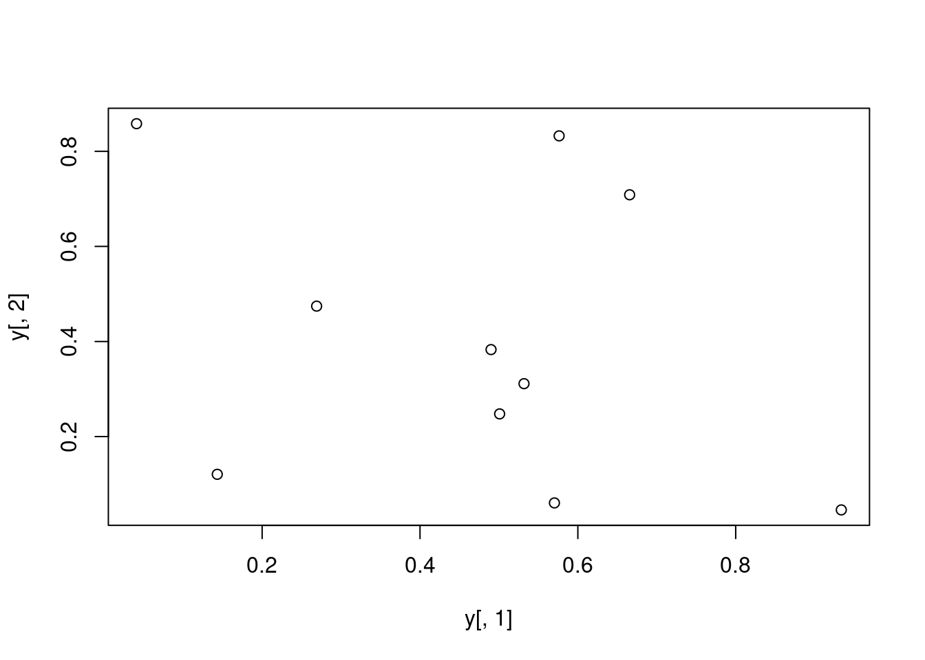
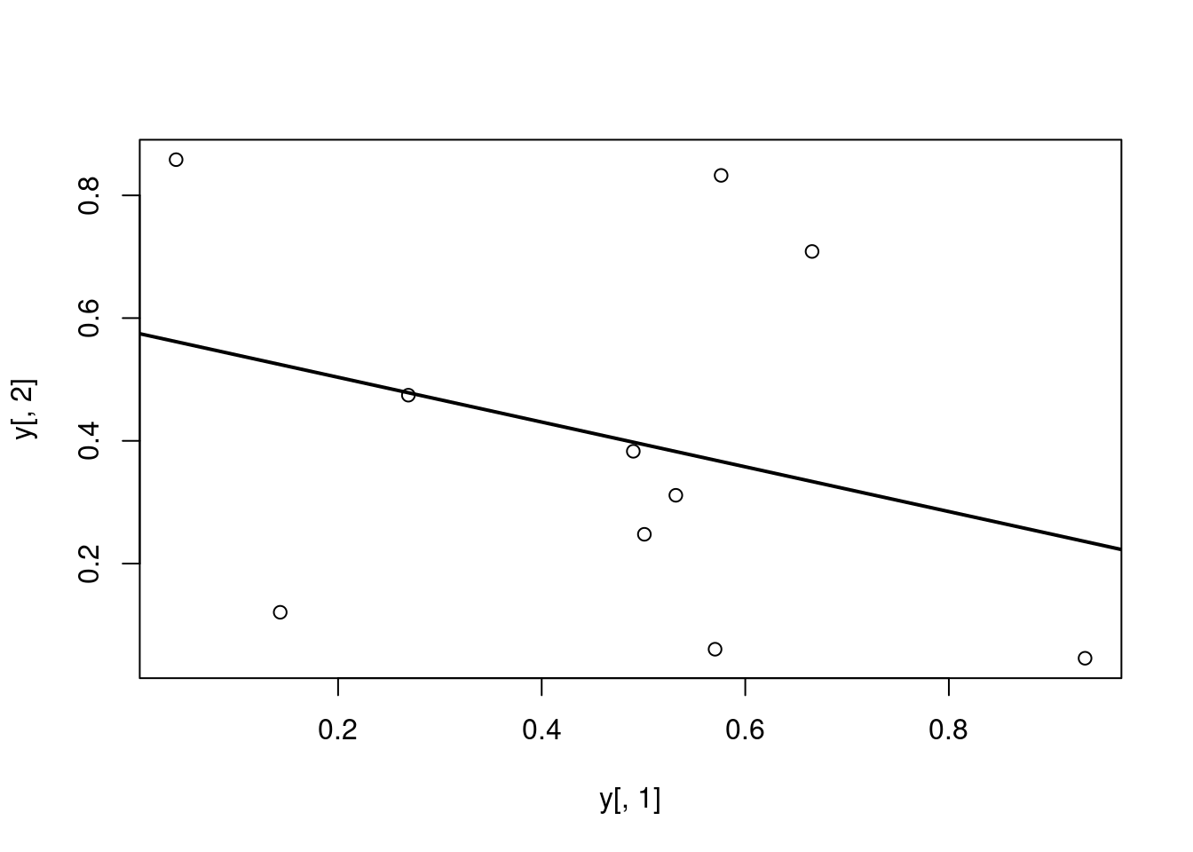
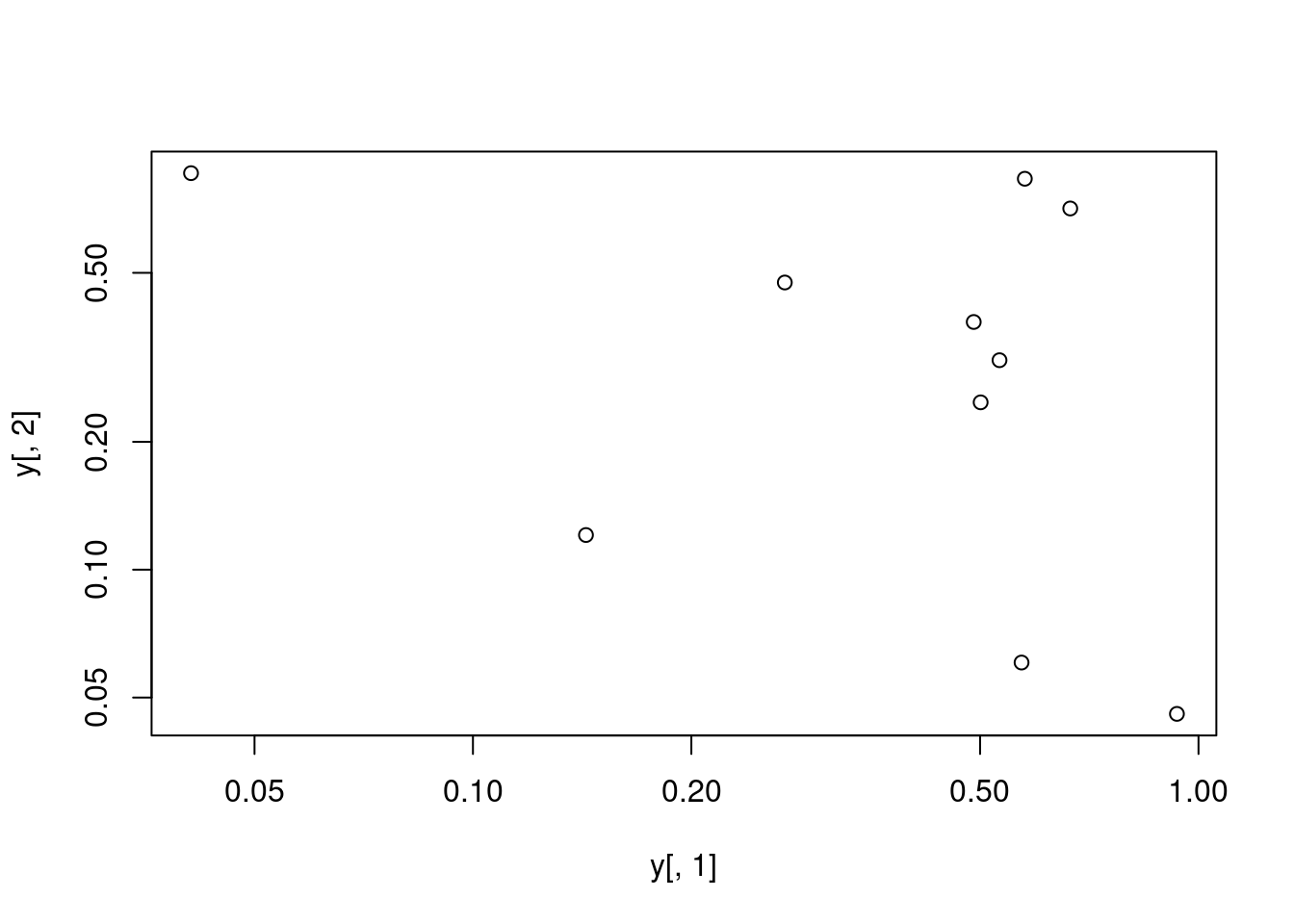
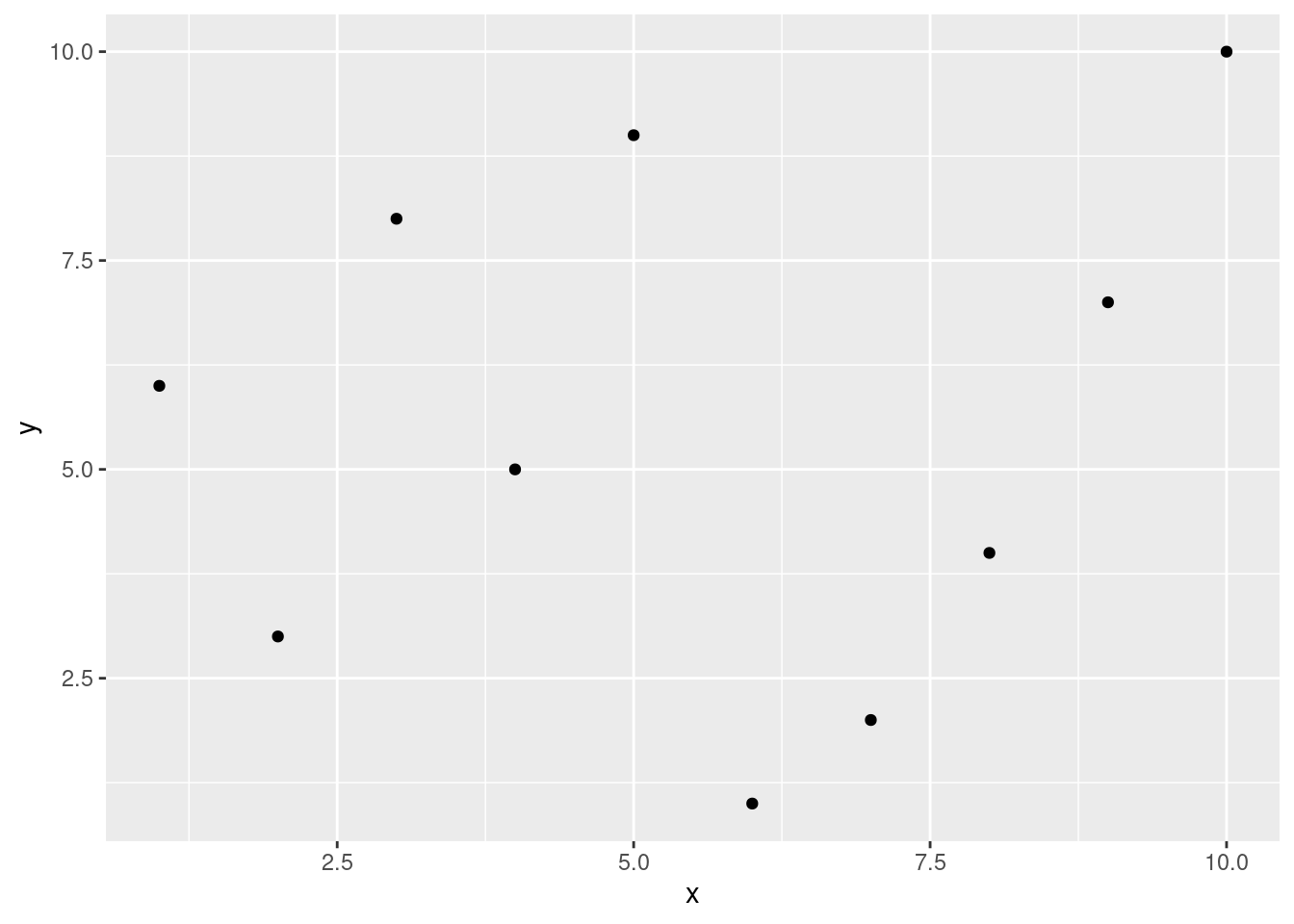
plot(y[,1], y[,2])
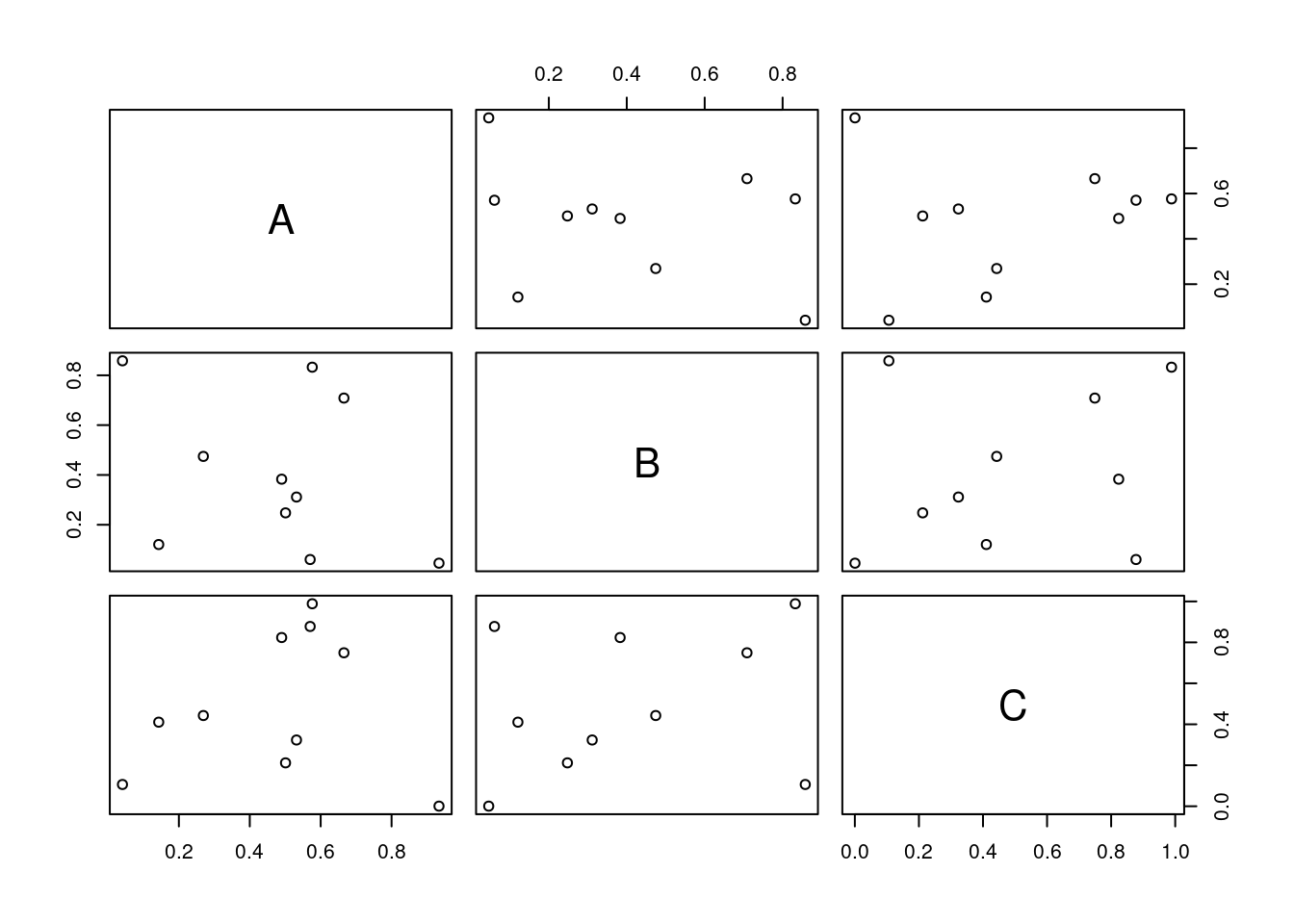
All pairs
pairs(y)
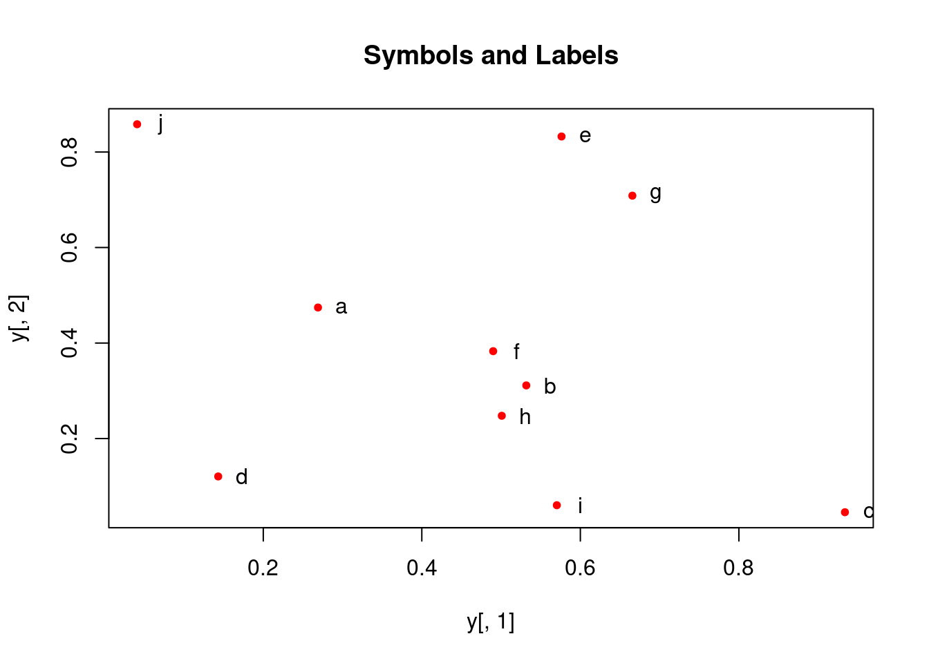
Plot labels
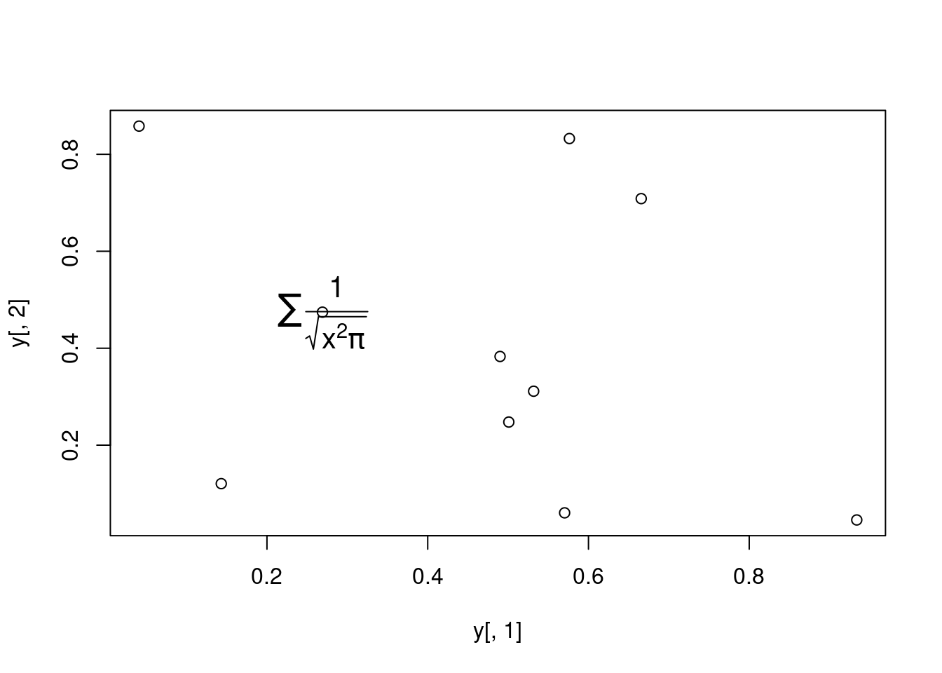
plot(y[,1], y[,2], pch=20, col="red", main="Symbols and Labels")text(y[,1]+0.03, y[,2], rownames(y))
More examples
Print instead of symbols the row names
plot(y[,1], y[,2], type="n", main="Plot of Labels")text(y[,1], y[,2], rownames(y))
Important arguments} - mar: specifies the margin sizes around the plotting area in order: c(bottom, left, top, right) - col: color of symbols - pch: type of symbols, samples: example(points) - lwd: size of symbols - cex.*: control font sizes - For details see ?par
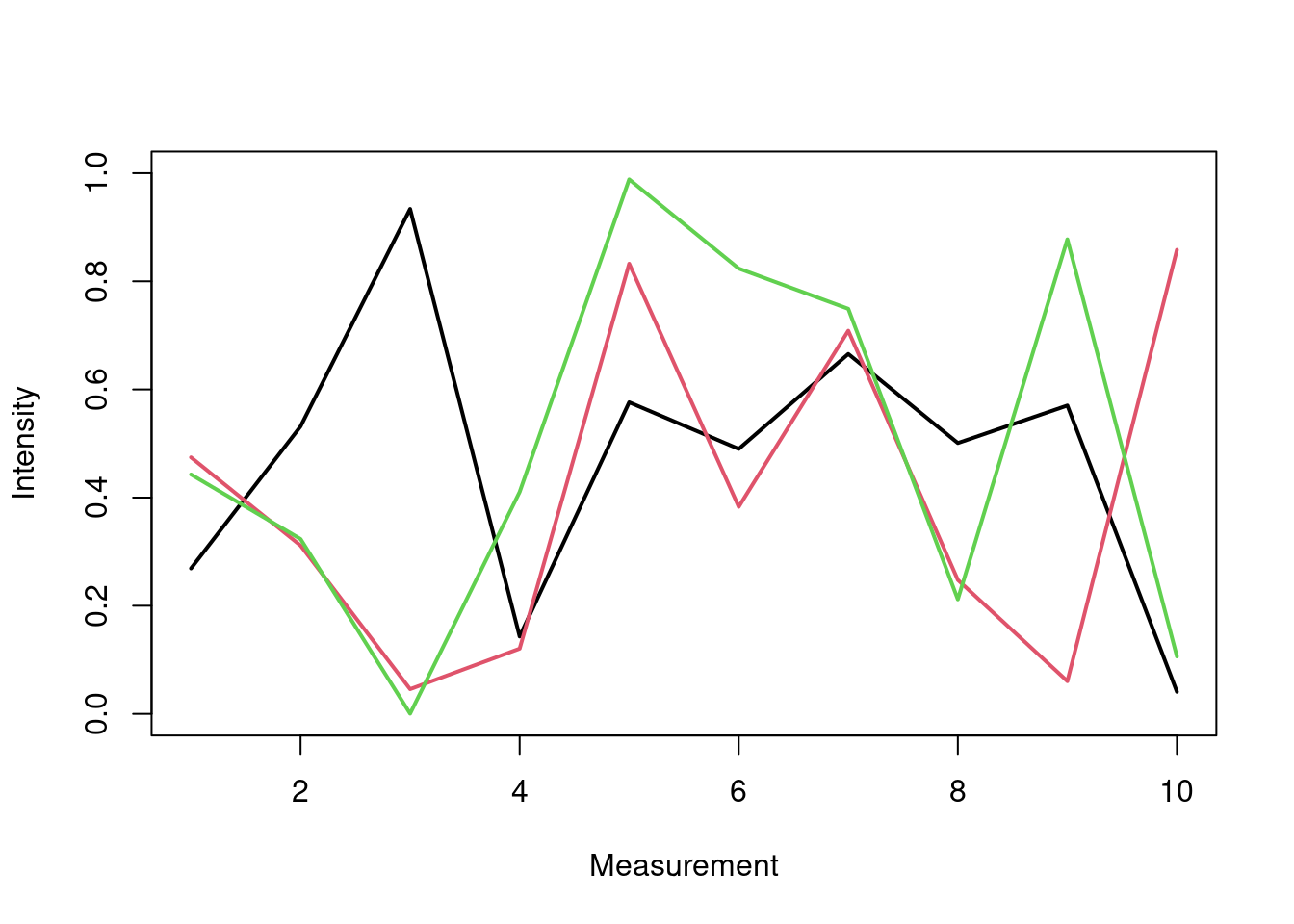
Alterntively, one can plot a line graph for all columns in data frame y with the following approach. The split.screen function is used in this example in a for loop to overlay several line graphs in the same plot.
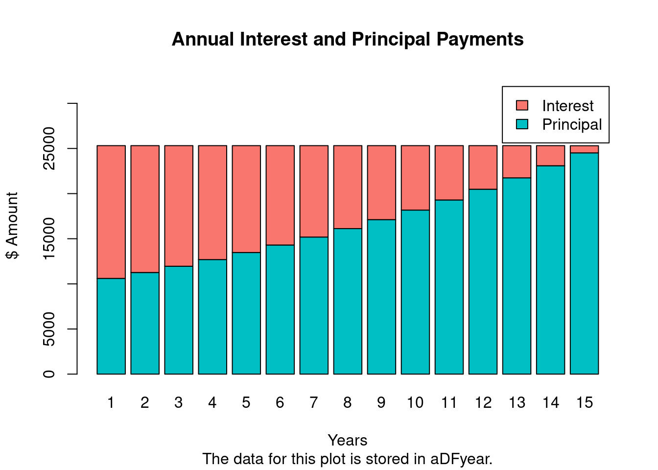
The following imports a mortgage payment function (from here) that calculates monthly and annual mortgage/loan payments, generates amortization tables and plots the results in form of a bar plot. A Shiny App using this function has been created by Antoine Soetewey here.
The monthly mortgage payments and amortization rates can be calculted with the mortgage() function like this:
m <- mortgage(P=500000, I=6, L=30, plotData=TRUE)
P = principal (loan amount)
I = annual interest rate
L = length of the loan in years
m <-mortgage(P=250000, I=6, L=15, plotData=TRUE)
The payments for this loan are:
Monthly payment: $2109.642 (stored in m$monthPay)
Total cost: $379735.6
The amortization data for each of the 180 months are stored in "m$aDFmonth".
The amortization data for each of the 15 years are stored in "m$aDFyear".
Much more on colors in R see Earl Glynn’s color chart
Arranging Several Plots on Single Page
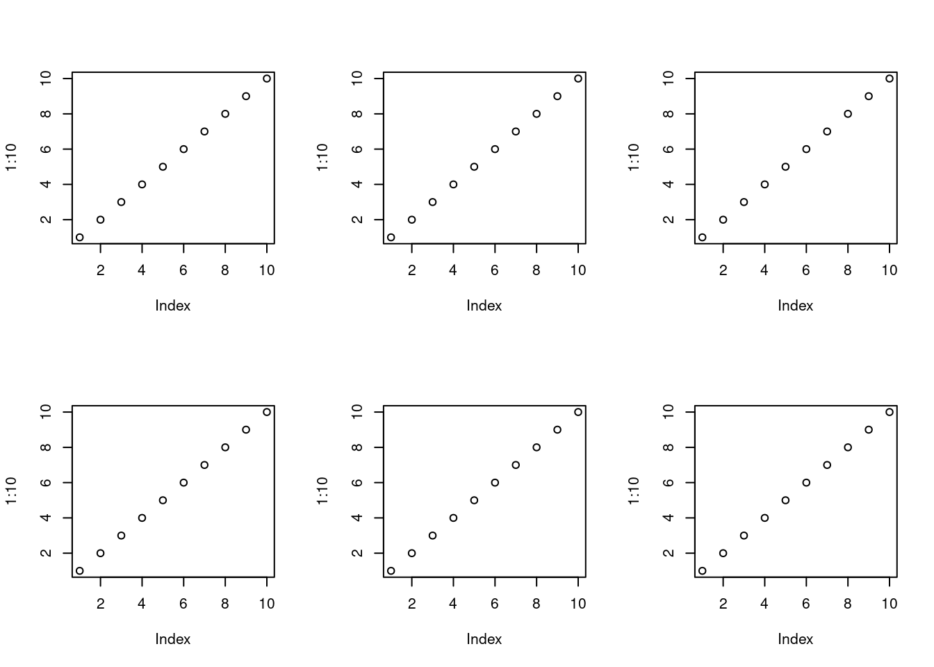
With par(mfrow=c(nrow, ncol)) one can define how several plots are arranged next to each other.
par(mfrow=c(2,3)) for(i in1:6) plot(1:10)
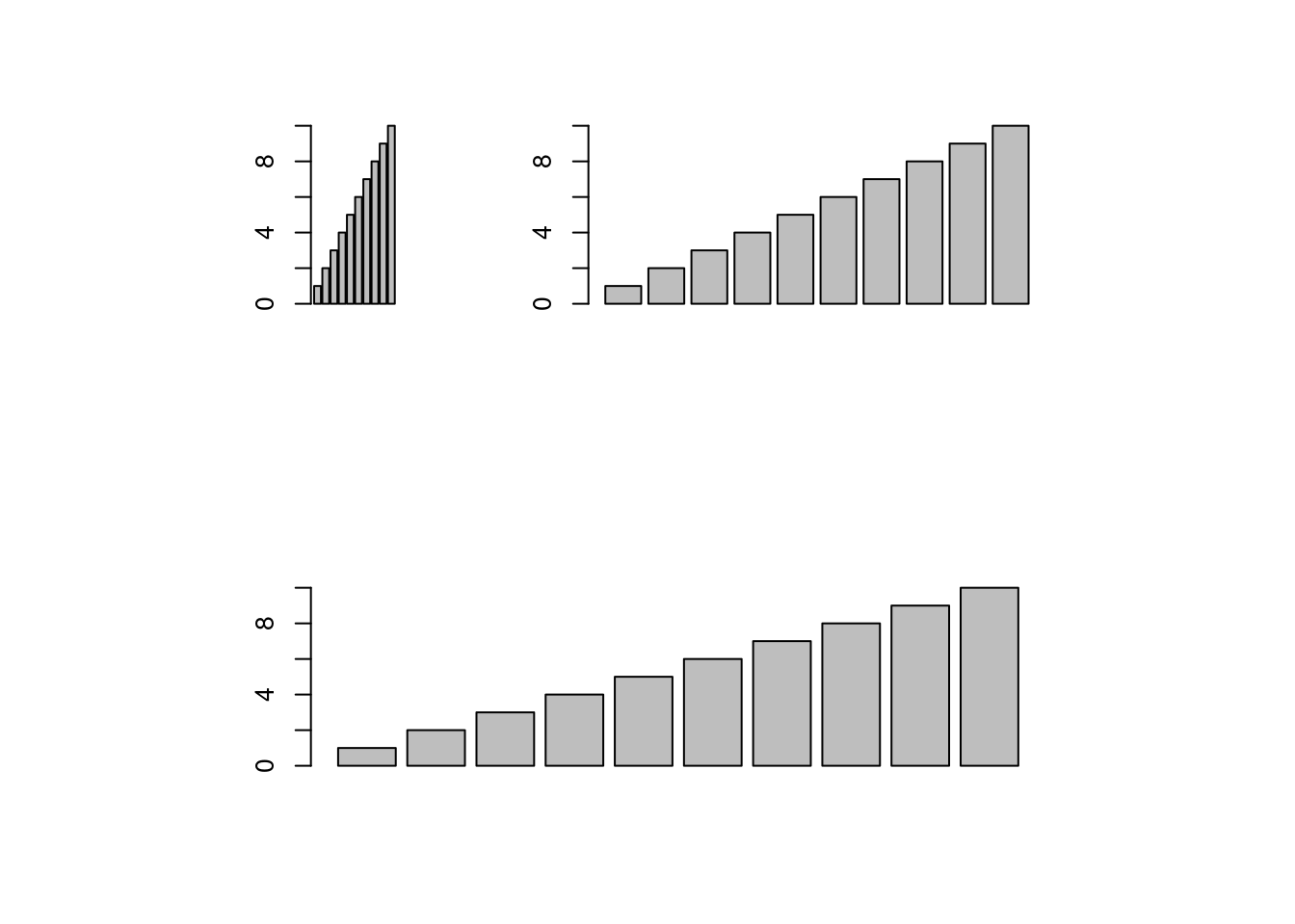
Arranging Plots with Variable Width
The layout function allows to divide the plotting device into variable numbers of rows and columns with the column-widths and the row-heights specified in the respective arguments.
After the pdf() command all graphs are redirected to file test.pdf. Works for all common formats similarly: jpeg, png, ps, tiff, …
pdf("test.pdf"); plot(1:10, 1:10); dev.off()
Generates Scalable Vector Graphics (SVG) files that can be edited in vector graphics programs, such as InkScape.
svg("test.svg"); plot(1:10, 1:10); dev.off()
Exercise 2
Bar plots
Task 1: Calculate the mean values for the Species components of the first four columns in the iris data set. Organize the results in a matrix where the row names are the unique values from the iris Species column and the column names are the same as in the first four iris columns.
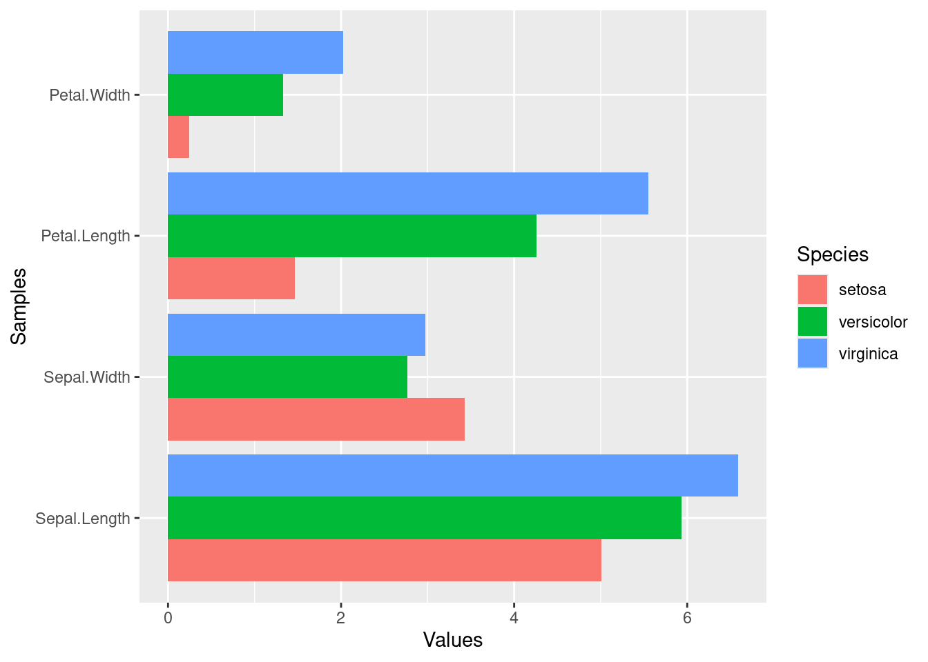
Task 2: Generate two bar plots: one with stacked bars and one with horizontally arranged bars.
Structure of iris data set:
class(iris)
[1] "data.frame"
iris[1:4,]
table(iris$Species)
    setosa versicolor  virginica
        50         50         50
Grid Graphics
What is grid?
Low-level graphics system
Highly flexible and controllable system
Does not provide high-level functions
Intended as development environment for custom plotting functions
Plotting formalized and implemented by the grammar of graphics by Leland Wilkinson and Hadley Wickham (Wickham 2010, 2009; Wilkinson 2012). The plotting process in ggplot2 is devided into layers including:
Theme: styles to be used, such as fonts, backgrounds, etc.
Coordinates: the plotting space
Statistics: data models and summaries
Facets: row and column layout of sub-plots
Geometries: shapes used to represent data (e.g. bar or scatter plot)
Aesthetics: the scales onto which the data will be mapped
Data: the actual data to be plotted
sphm
ggplot2 Usage
ggplot function accepts two main arguments
Data set to be plotted
Aesthetic mappings provided by aes function
Additional parameters such as geometric objects (e.g. points, lines, bars) are passed on by appending them with + as separator.
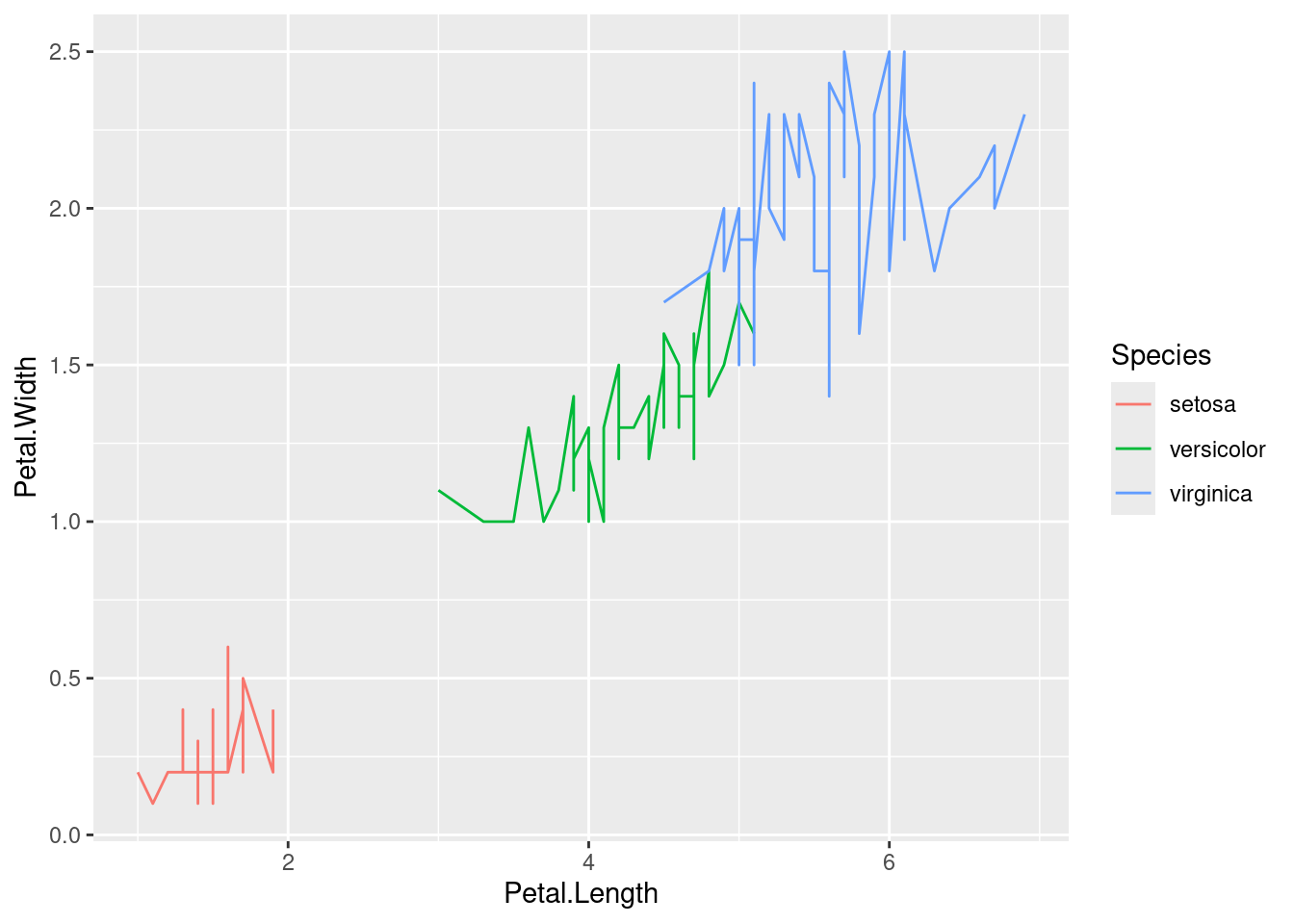
p <-ggplot(iris, aes(Petal.Length, Petal.Width, group=Species, color=Species)) +geom_line() print(p)
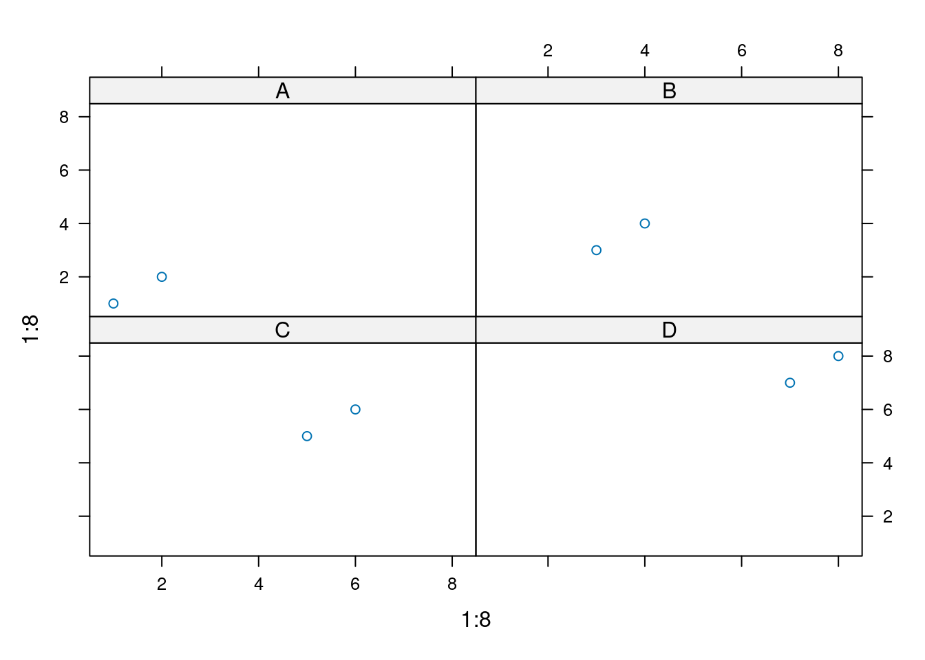
Faceting
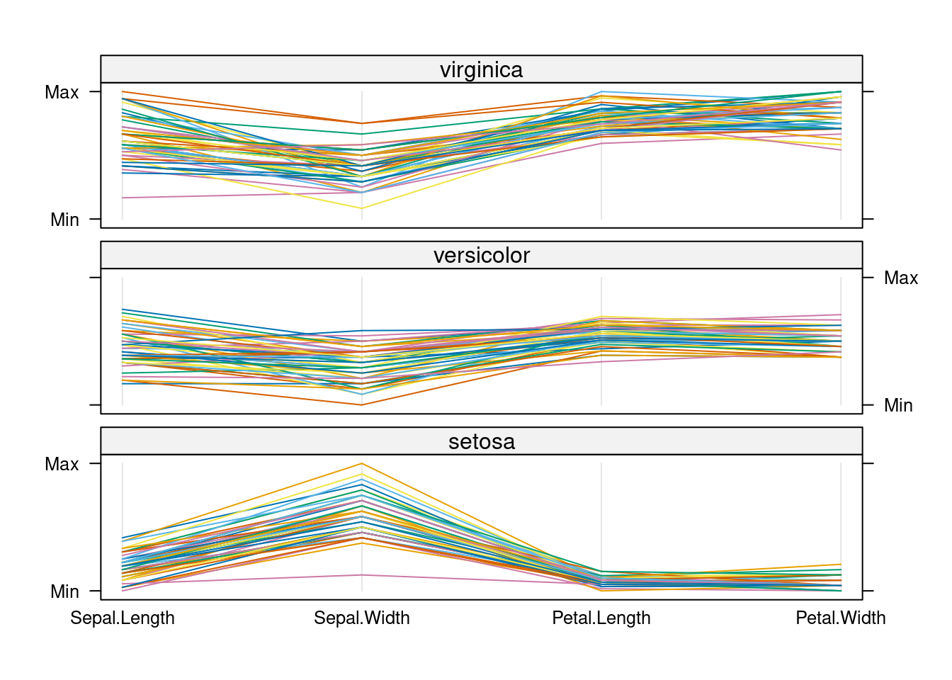
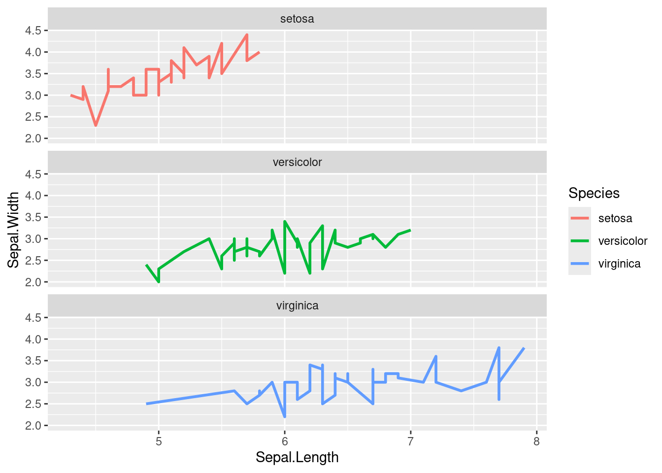
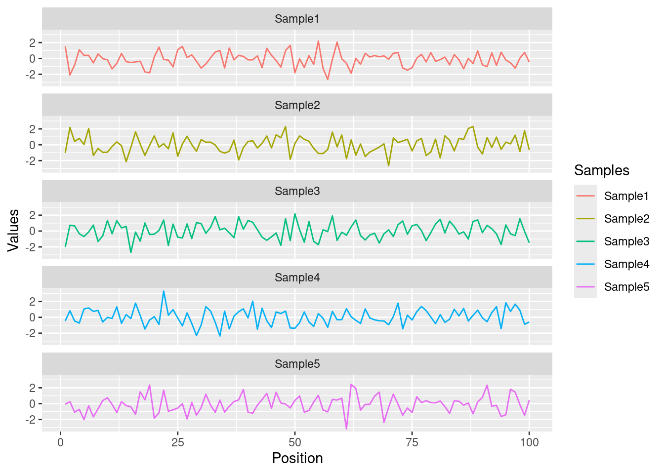
p <-ggplot(iris, aes(Sepal.Length, Sepal.Width)) +geom_line(aes(color=Species), size=1) +facet_wrap(~Species, ncol=1)print(p)
Exercise 3
Scatter plots with ggplot2
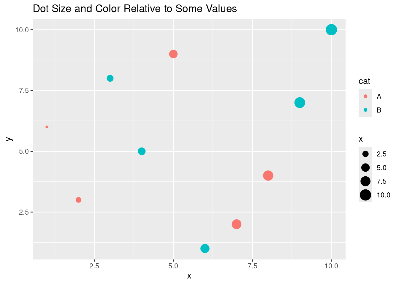
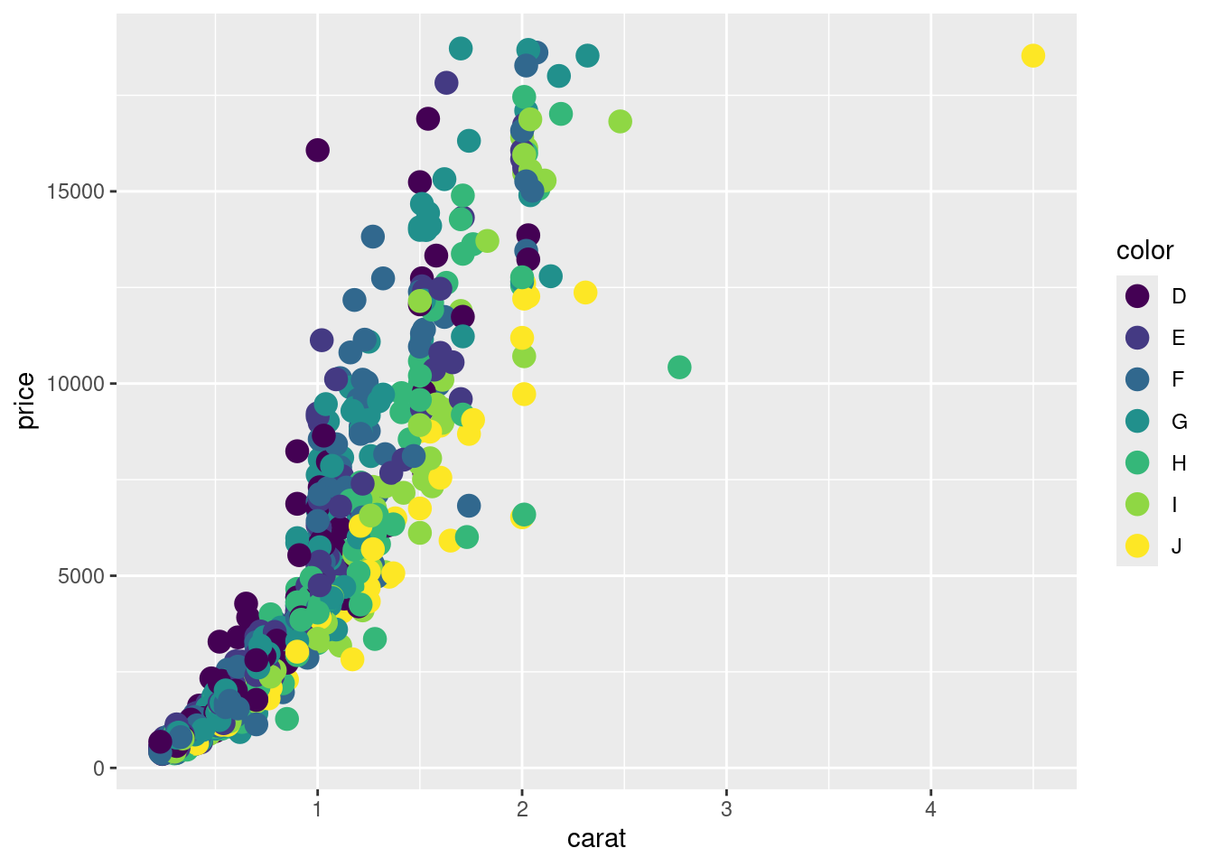
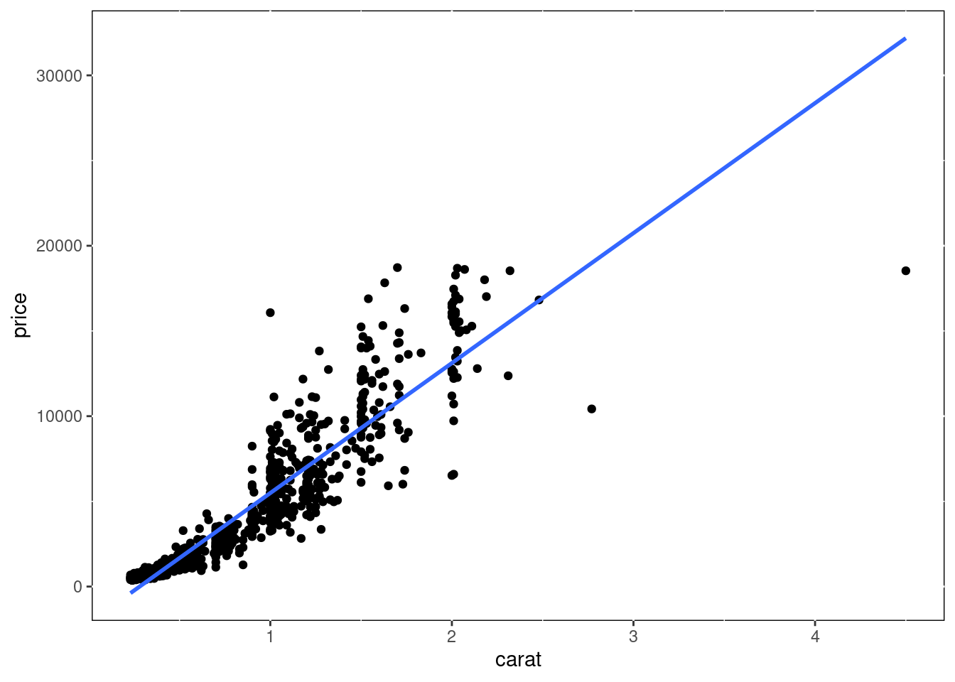
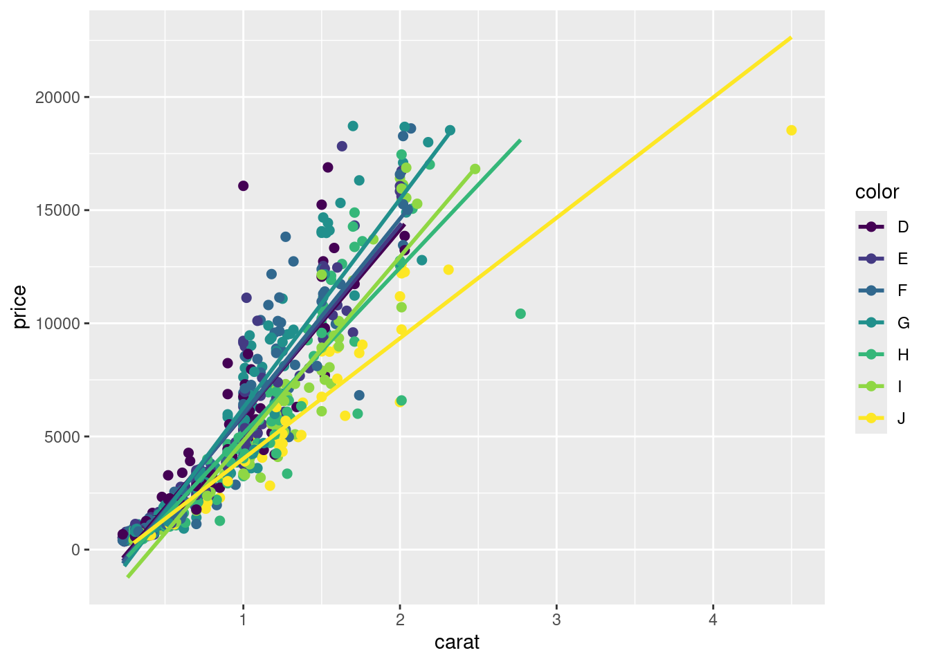
Task 1: Generate scatter plot for first two columns in iris data frame and color dots by its Species column.
Task 2: Use the xlim and ylim arguments to set limits on the x- and y-axes so that all data points are restricted to the left bottom quadrant of the plot.
Task 3: Generate corresponding line plot with faceting presenting the individual data sets in saparate plots.
Structure of iris data set
class(iris)
[1] "data.frame"
iris[1:4,]
table(iris$Species)
    setosa versicolor  virginica
        50         50         50
Bar Plots
Sample Set: the following transforms the iris data set into a ggplot2-friendly format.
Calculate mean values for aggregates given by Species column in iris data set
Reformat iris_mean with melt from wide to long form as expected by ggplot2. Newer alternatives for restructuring data.frames and tibbles from wide into long form use the gather and pivot_longer functions defined by the tidyr package. Their usage is shown below as well. The functions pivot_longer and pivot_wider are expected to provide the most flexible long-term solution, but may not work in older R versions.
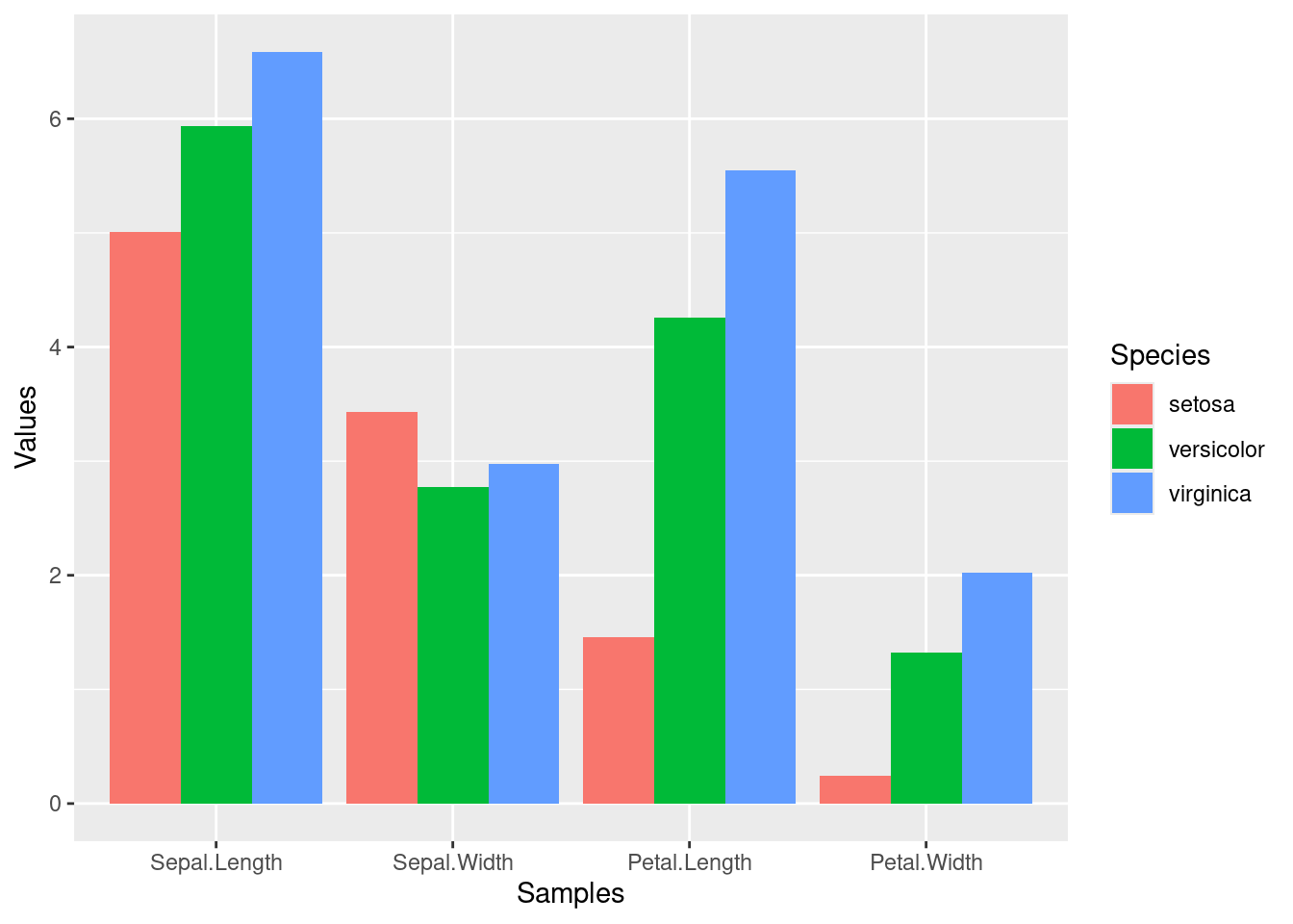
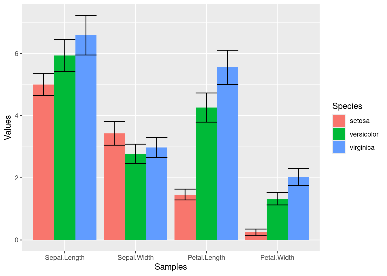
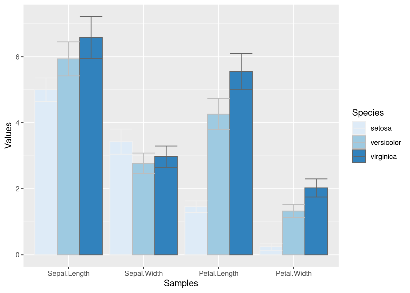
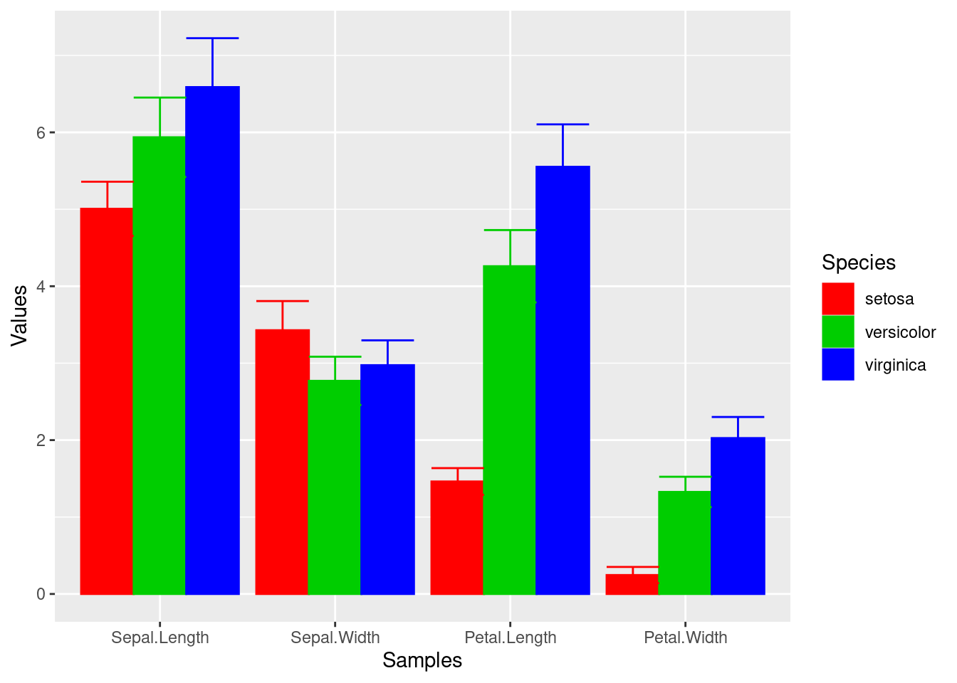
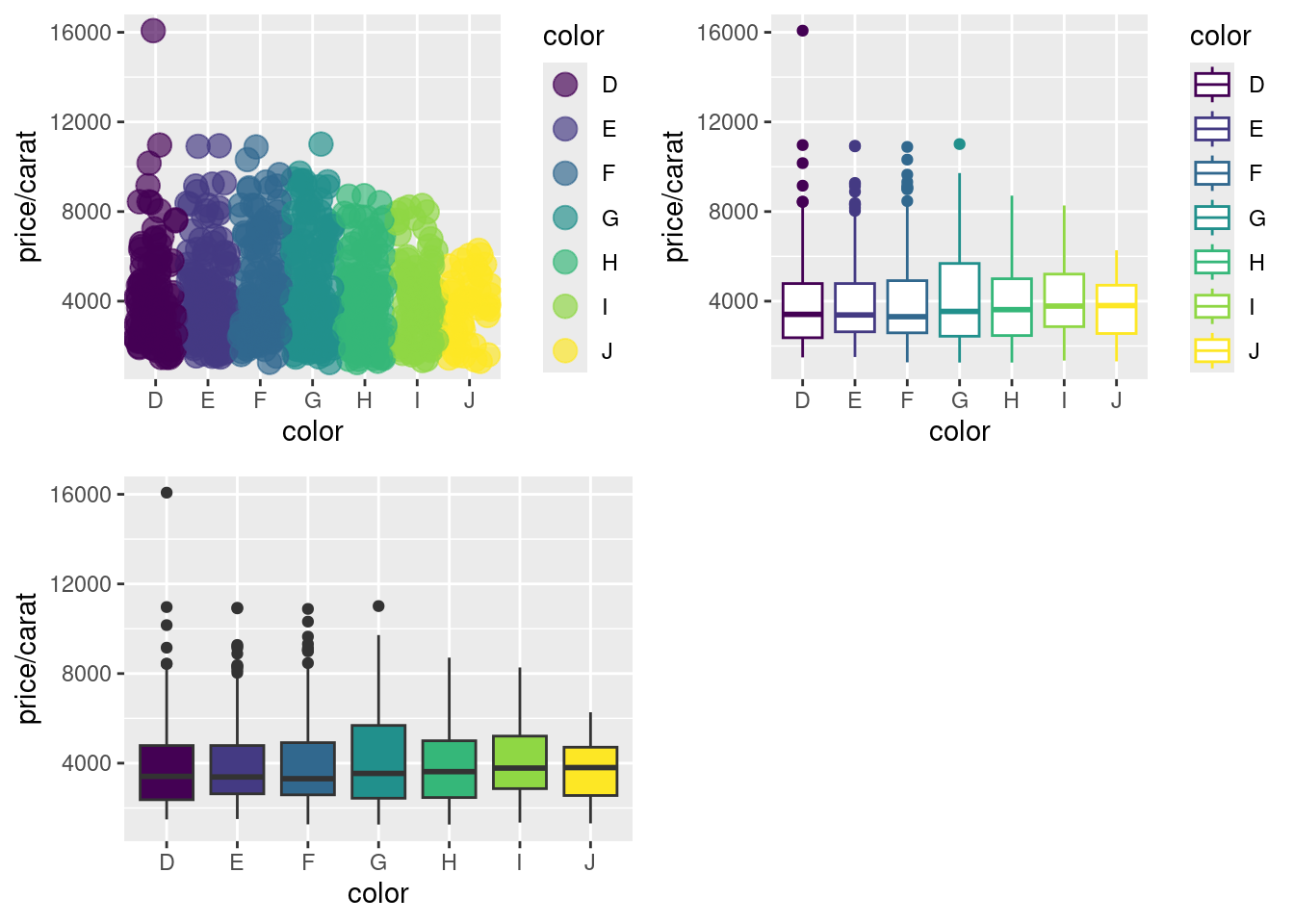
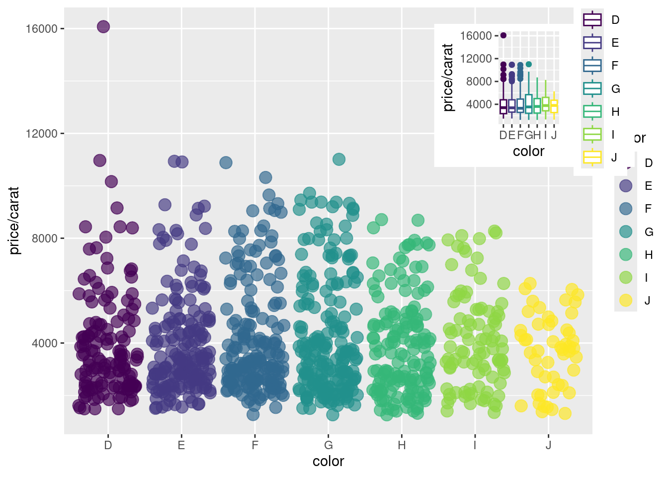
p <-ggplot(df_mean, aes(Samples, Values, fill = Species)) +geom_bar(position="dodge", stat="identity")print(p)
To enforce that the bars are plotted in the order specified in the input data, one can instruct ggplot to do so by turning the corresponding column (here Species) into an ordered factor as follows.
Task 1: Calculate the mean values for the Species components of the first four columns in the iris data set. Use the melt function from the reshape2 package to bring the data into the expected format for ggplot.
Task 2: Generate two bar plots: one with stacked bars and one with horizontally arranged bars.
Structure of iris data set
class(iris)
[1] "data.frame"
iris[1:4,]
table(iris$Species)
    setosa versicolor  virginica
        50         50         50
Data reformatting example
Here for line plot
y <-matrix(rnorm(500), 100, 5, dimnames=list(paste("g", 1:100, sep=""), paste("Sample", 1:5, sep="")))y <-data.frame(Position=1:length(y[,1]), y)y[1:4, ] # First rows of input format expected by melt()
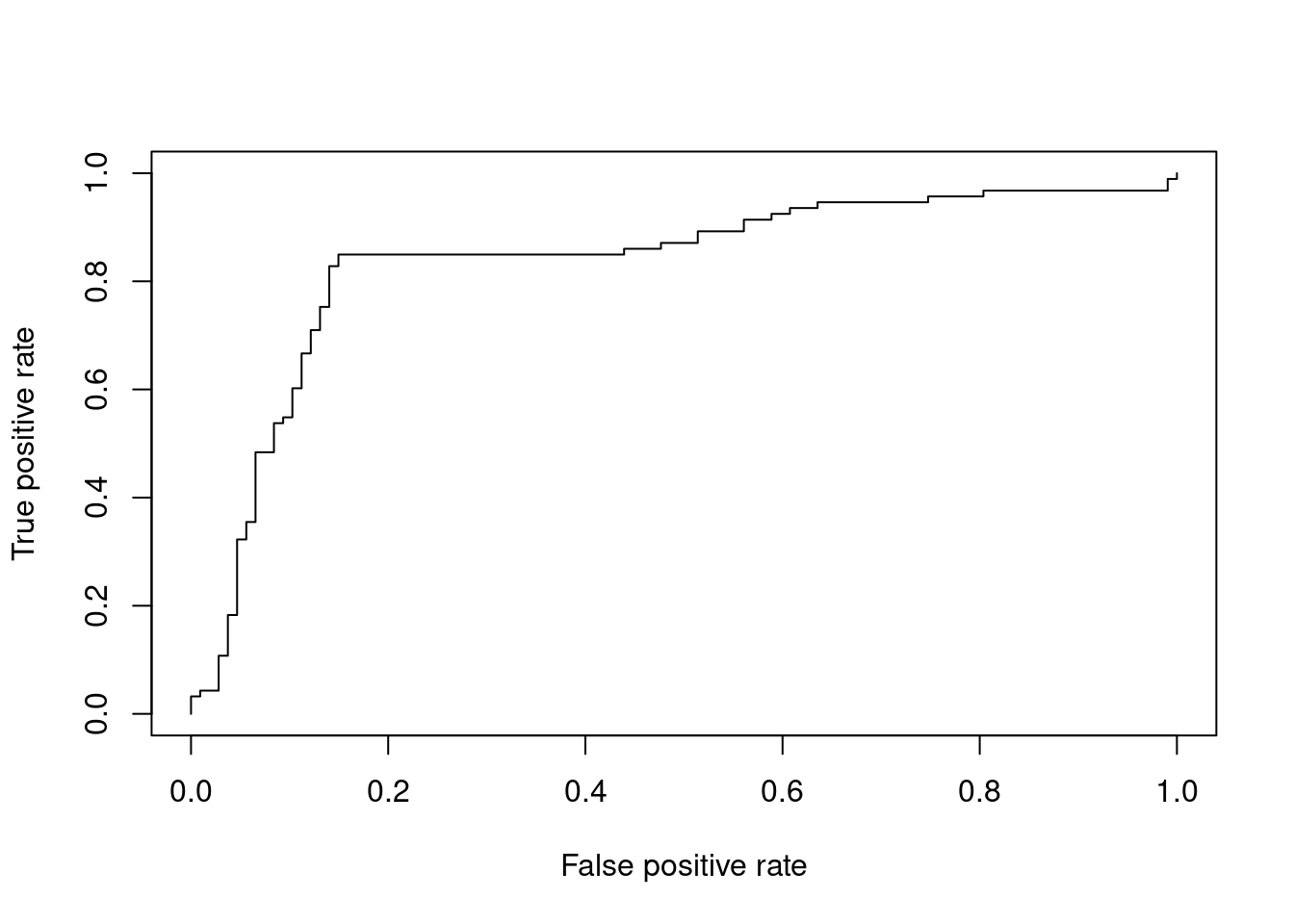
Most commonly, in an ROC we plot the true positive rate (y-axis) against the false positive rate (x-axis) at decreasing thresholds. An illustrative example is provided in the ROCR package where one wants to inspect the content of the ROCR.simple object defining the structure of the input data in two vectors.
# install.packages("ROCR") # Install if necessarylibrary(ROCR)data(ROCR.simple)ROCR.simple
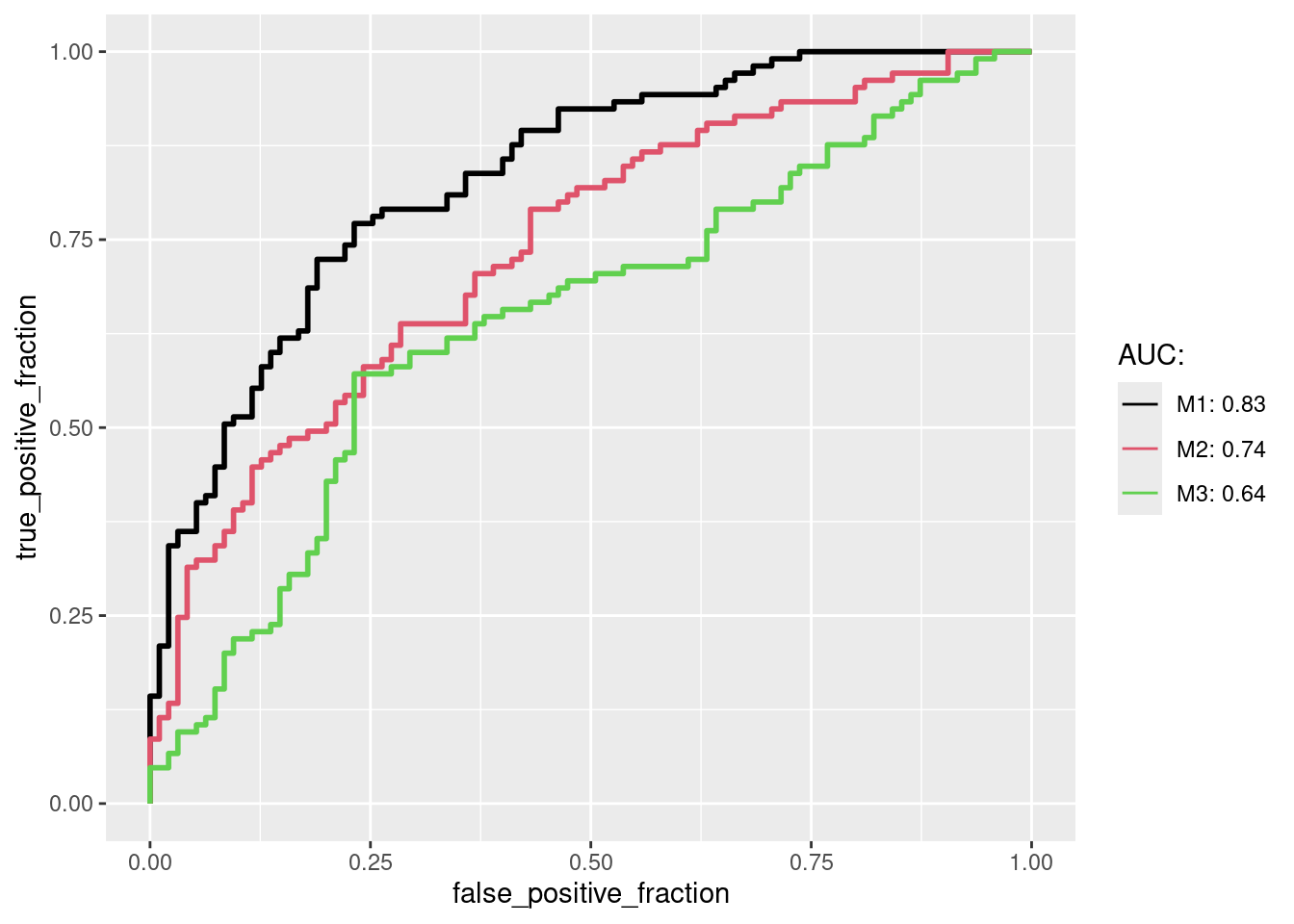
The plotROC package plots ROCs with ggplot2. The following generates a sample data set for several performance results, here three. For convenience the data are first arranged in a data.frame in wide format. Next, the melt_roc is used to convert the data.frame into the long format as required by ggplot.
long_perfDF <-melt_roc(perfDF, "D", c("M1", "M2", "M3")) # transformed into long format for ggplotlong_perfDF[1:4,] # long format
After converting the sample data into the long format the results can be plotted with geom_roc, where several ROCs are combined in a single plot and the corresponding AUC values are shown in the legend.
multi_roc <-ggplot(long_perfDF, aes(d = D, m = M, color = name)) +geom_roc(n.cuts=0) auc_df <-calc_auc(multi_roc) # calculate AUC valuesauc_str <-paste0(auc_df$name, ": ", round(auc_df$AUC, 2))multi_roc +scale_color_manual(name="AUC:", labels=auc_str, values=seq_along(auc_str))
Trees
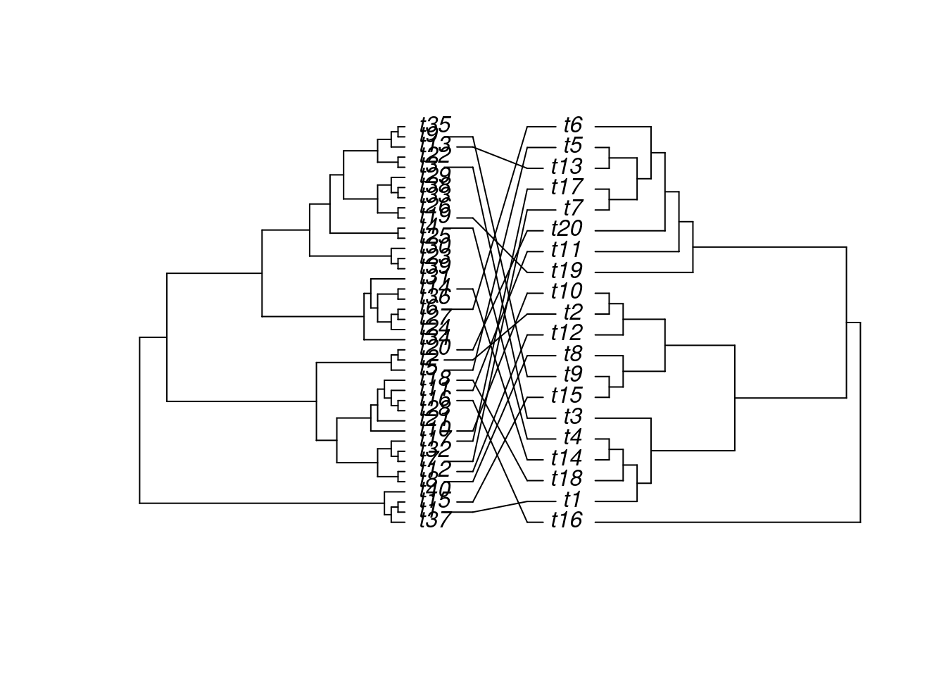
The ape package provides many useful utilities for phylogenetic analysis and tree plotting. Another useful package for plotting trees is ggtree. The following example plots two trees face to face with links to identical leaf labels.
library(ape)tree1 <-rtree(40)tree2 <-rtree(20)association <-cbind(tree2$tip.label, tree2$tip.label)cophyloplot(tree1, tree2, assoc = association,length.line =4, space =28, gap =3)
Genome Graphics
ggbio
What is ggbio?
A programmable genome browser environment
Genome broswer concepts
A genome browser is a visulalization tool for plotting different types of genomic data in separate tracks along chromosomes.
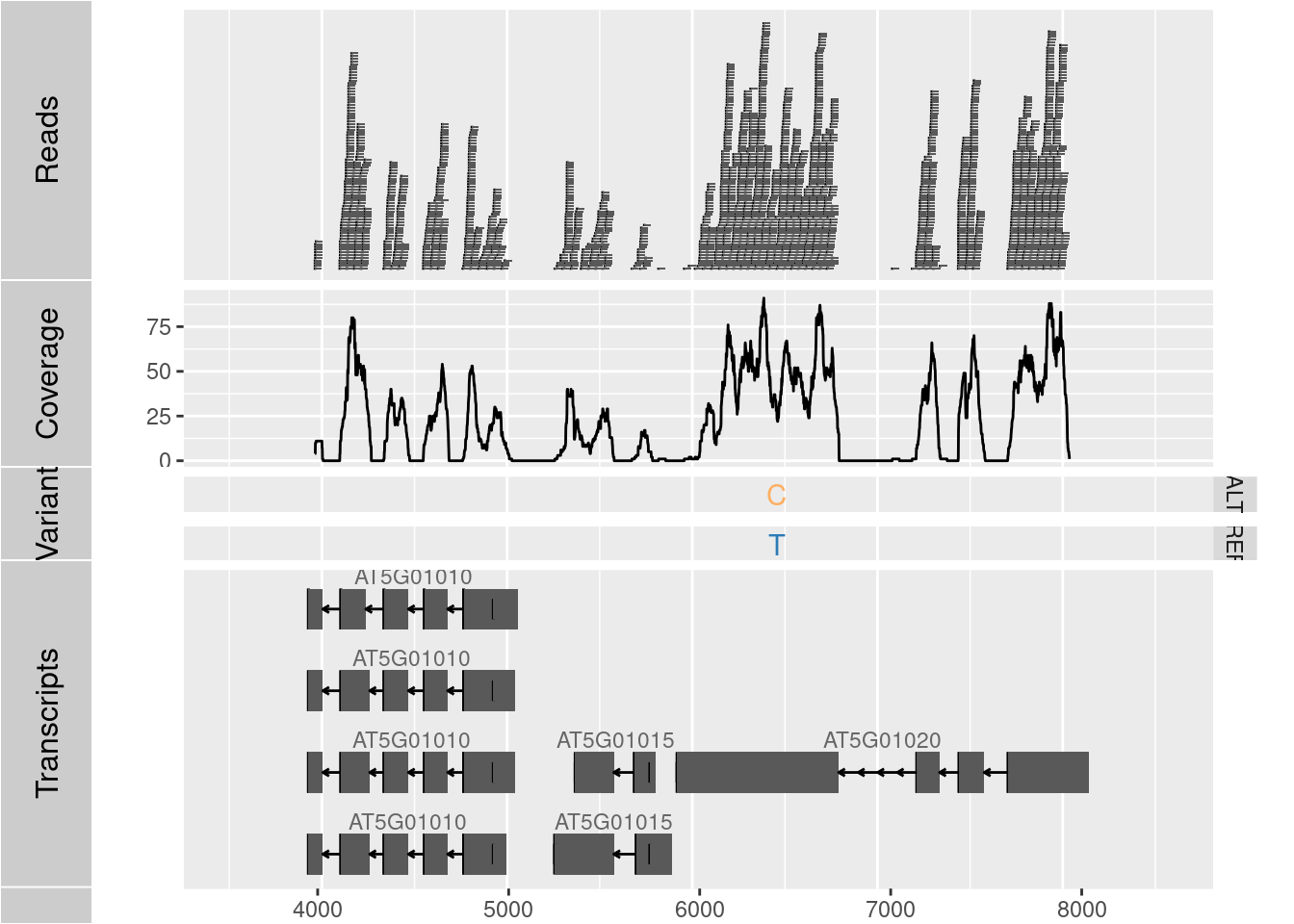
The ggbio package (Yin, Cook, and Lawrence 2012) facilitates plotting of complex genome data objects, such as read alignments (SAM/BAM), genomic context/annotation information (gff/txdb), variant calls (VCF/BCF), and more. To easily compare these data sets, it extends the faceting facility of ggplot2 to genome browser-like tracks.
Most of the core object types for handling genomic data with R/Bioconductor are supported: GRanges, GAlignments, VCF, etc. For more details, see Table 1.1 of the ggbio vignette here.
ggbio’s convenience plotting function is autoplot. For more customizable plots, one can use the generic ggplot function.
Apart from the standard ggplot2 plotting components, ggbio defines serval new components useful for genomic data visualization. A detailed list is given in Table 1.2 of the vignette here.
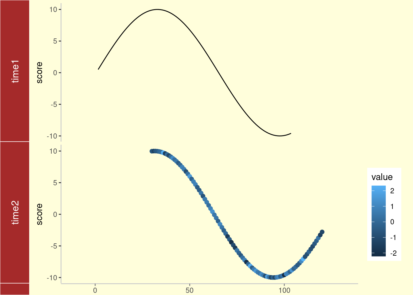
library(ggbio)df1 <-data.frame(time =1:100, score =sin((1:100)/20)*10)p1 <-qplot(data = df1, x = time, y = score, geom ="line")df2 <-data.frame(time =30:120, score =sin((30:120)/20)*10, value =rnorm(120-30+1))p2 <-ggplot(data = df2, aes(x = time, y = score)) +geom_line() +geom_point(size =2, aes(color = value))tracks(time1 = p1, time2 = p2) +xlim(1, 40) +theme_tracks_sunset()
Plotting genomic ranges
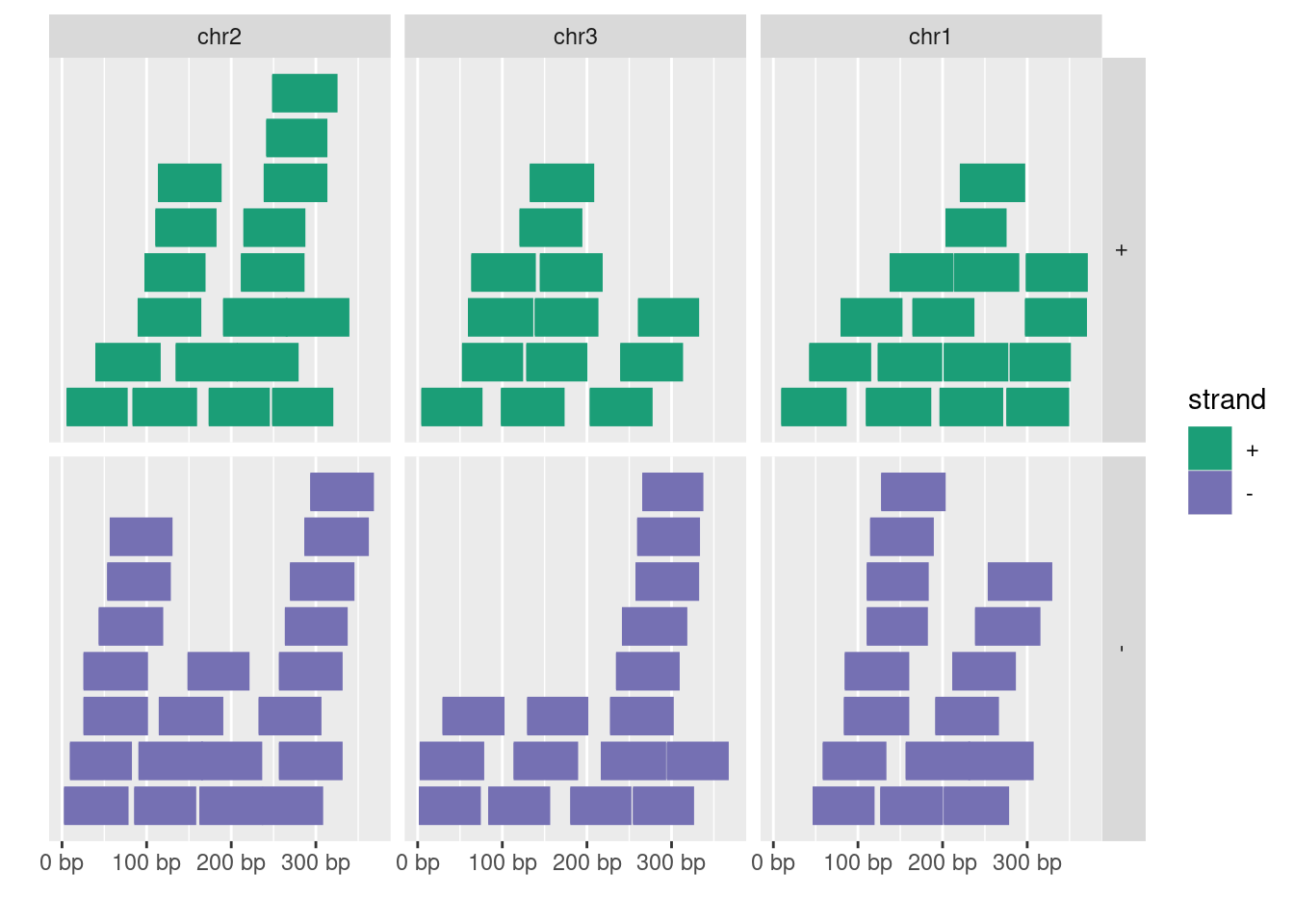
GRanges objects are essential for storing alignment or annotation ranges in R/Bioconductor. The following creates a sample GRanges object and plots its content.
library(GenomicRanges)set.seed(1); N <-100; gr <-GRanges(seqnames =sample(c("chr1", "chr2", "chr3"), size = N, replace =TRUE), IRanges(start =sample(1:300, size = N, replace =TRUE), width =sample(70:75, size = N,replace =TRUE)), strand =sample(c("+", "-"), size = N, replace =TRUE), value =rnorm(N, 10, 3), score =rnorm(N, 100, 30), sample =sample(c("Normal", "Tumor"), size = N, replace =TRUE), pair =sample(letters, size = N, replace =TRUE))autoplot(gr, aes(color = strand, fill = strand), facets = strand ~ seqnames)
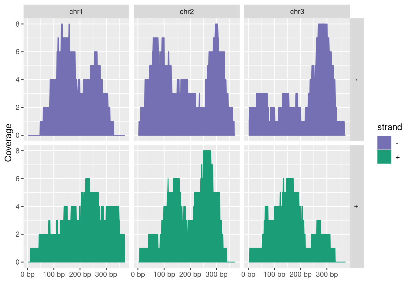
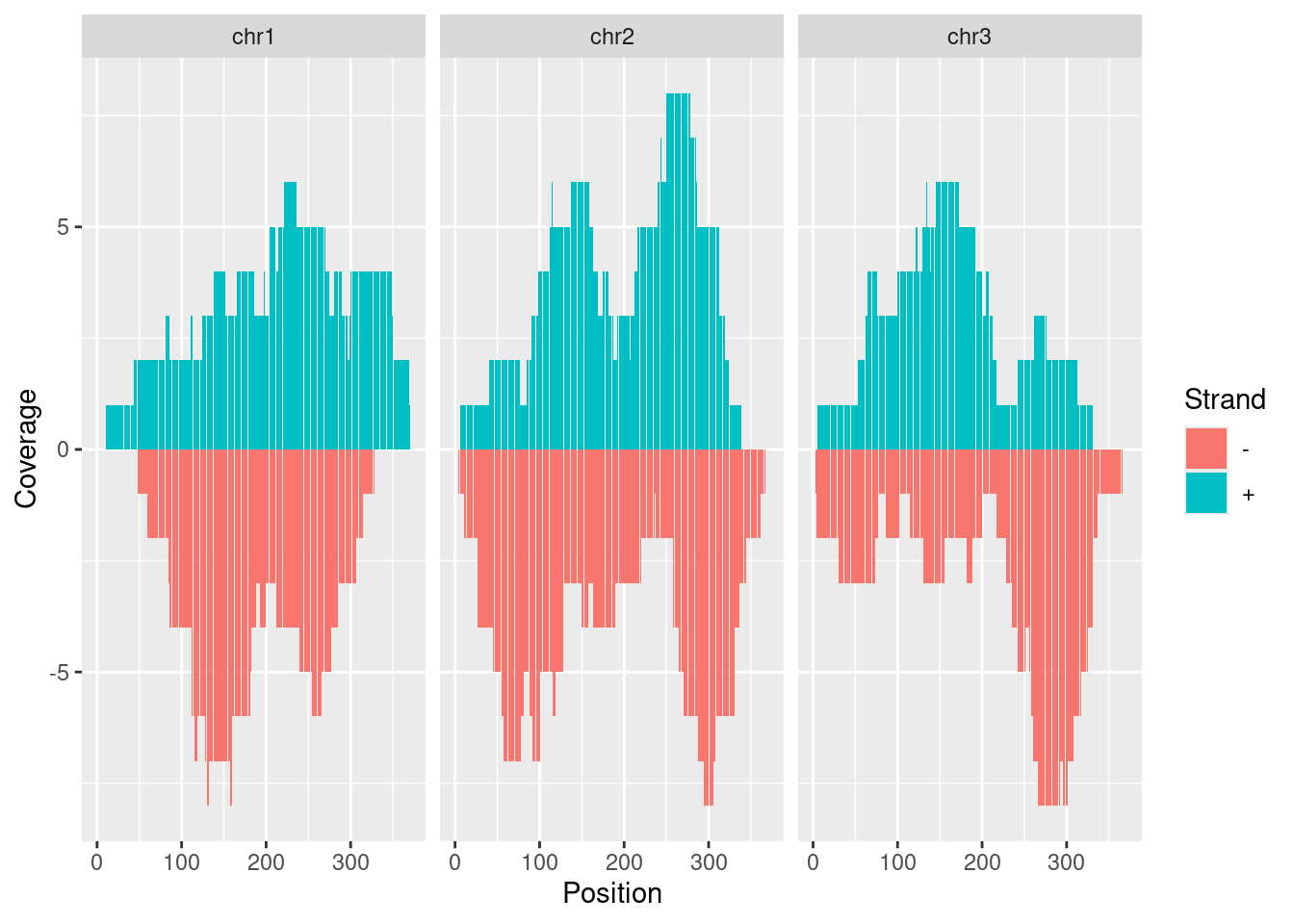
Plotting coverage
autoplot(gr, aes(color = strand, fill = strand), facets = strand ~ seqnames, stat ="coverage")
Open IGV before running the following routine. Alternatively, open IGV from within R with startIGV("lm"). Note, the latter may not work on all systems.
Wilkinson, Leland. 2012. “The Grammar of Graphics.” In Handbook of Computational Statistics: Concepts and Methods, edited by James E Gentle, Wolfgang Karl Härdle, and Yuichi Mori, 375–414. Berlin, Heidelberg: Springer Berlin Heidelberg. https://doi.org/10.1007/978-3-642-21551-3\_13.
Yin, T, D Cook, and M Lawrence. 2012. “Ggbio: An R Package for Extending the Grammar of Graphics for Genomic Data.”Genome Biol. 13 (8). https://doi.org/10.1186/gb-2012-13-8-r77.
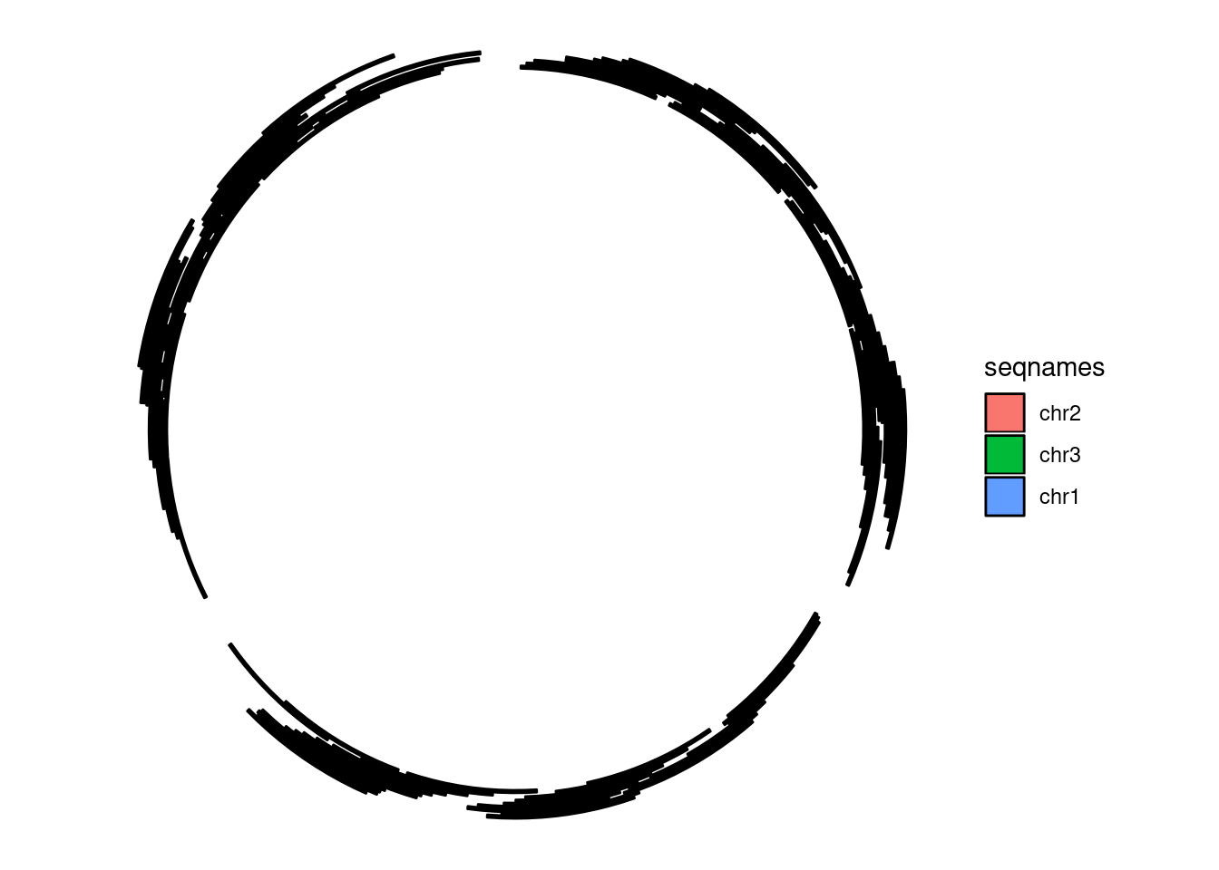
Zhang, H, P Meltzer, and S Davis. 2013. “RCircos: An R Package for Circos 2D Track Plots.”BMC Bioinformatics 14: 244–44. https://doi.org/10.1186/1471-2105-14-244.