- What is
ggplot2?- High-level graphics system developed by Hadley Wickham
- Implements grammar of graphics from Leland Wilkinson
- Streamlines many graphics workflows for complex plots
- Syntax centered around main
ggplotfunction - Simpler
qplotfunction provides many shortcuts
- Documentation and Help
ggplot2 Usage
ggplotfunction accepts two arguments- Data set to be plotted
- Aesthetic mappings provided by
aesfunction
- Additional parameters such as geometric objects (e.g. points, lines, bars) are passed on by appending them with
+as separator. - List of available
geom_*functions see here - Settings of plotting theme can be accessed with the command
theme_get()and its settings can be changed withtheme(). - Preferred input data object
qplot:data.frameortibble(support forvector,matrix,...)ggplot:data.frameortibble
- Packages with convenience utilities to create expected inputs
plyrreshape
qplot Function
The syntax of qplot is similar as R’s basic plot function
- Arguments
x: x-coordinates (e.g.col1)y: y-coordinates (e.g.col2)data:data.frameortibblewith corresponding column namesxlim, ylim: e.g.xlim=c(0,10)log: e.g.log="x"orlog="xy"main: main title; see?plotmathfor mathematical formulaxlab, ylab: labels for the x- and y-axescolor,shape,size...: many arguments accepted byplotfunction
qplot: scatter plot basics
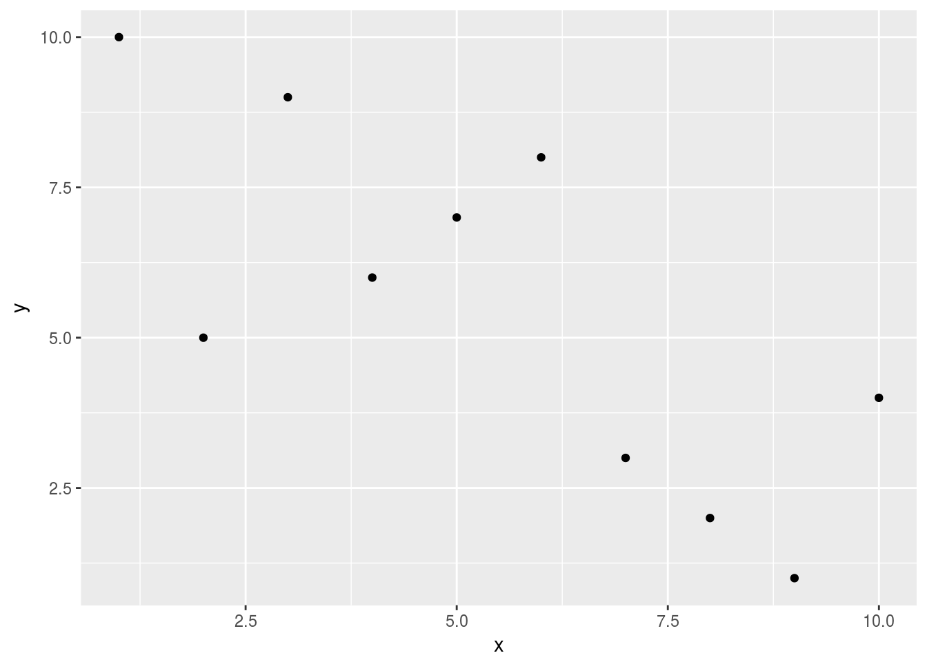
Create sample data
library(ggplot2)
x <- sample(1:10, 10); y <- sample(1:10, 10); cat <- rep(c("A", "B"), 5)
Simple scatter plot
qplot(x, y, geom="point")
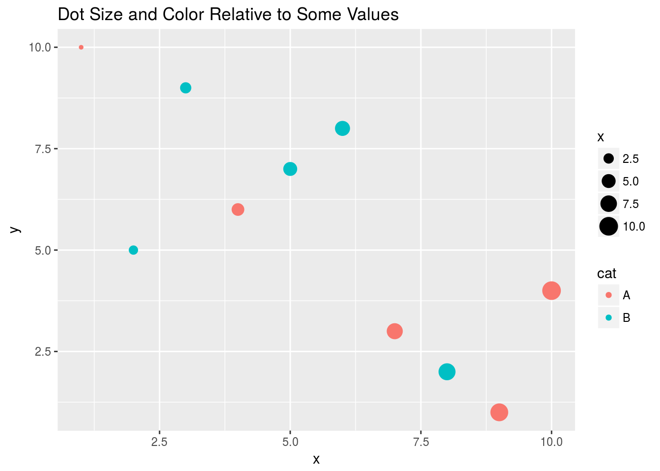
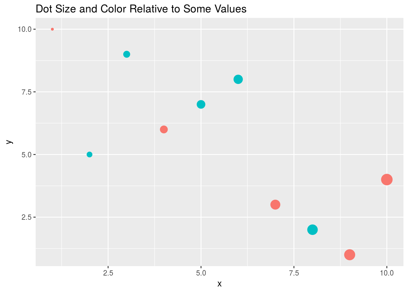
Prints dots with different sizes and colors
qplot(x, y, geom="point", size=x, color=cat,
      main="Dot Size and Color Relative to Some Values")
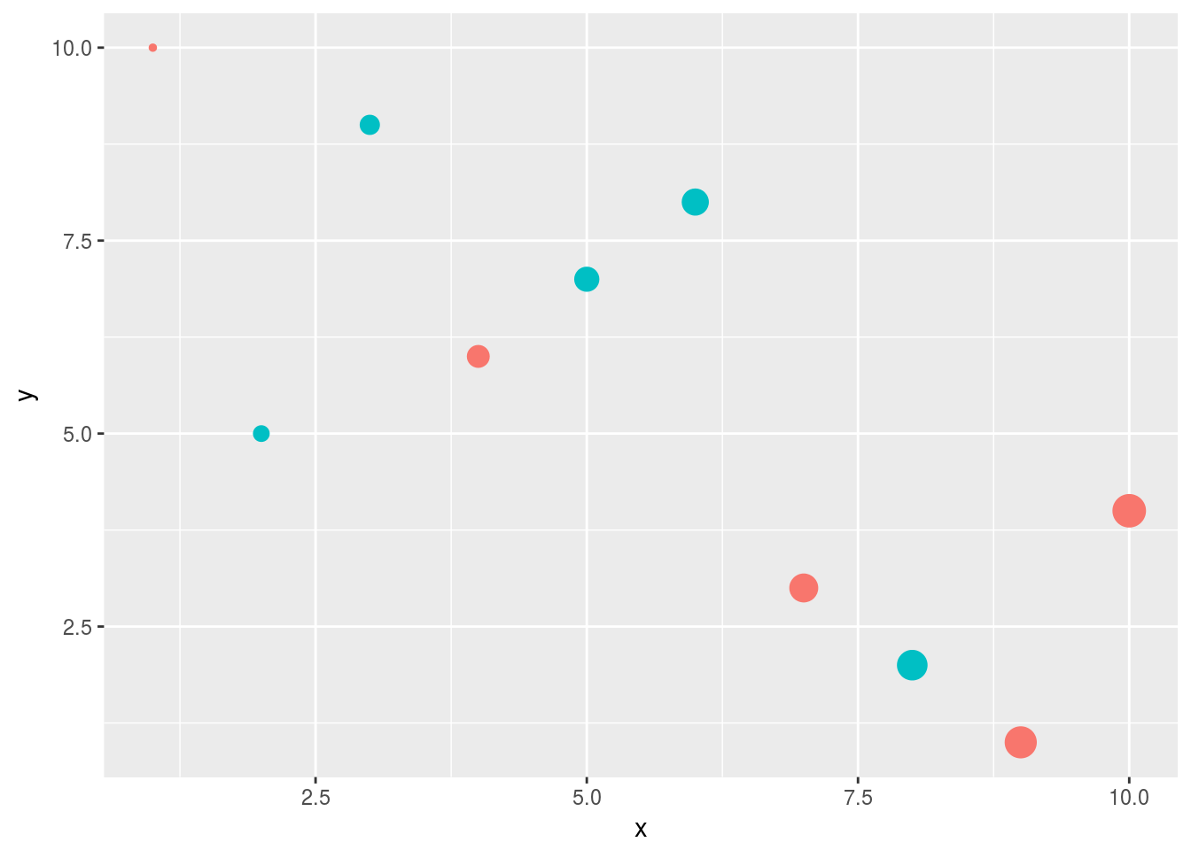
Drops legend
qplot(x, y, geom="point", size=x, color=cat) +
      theme(legend.position = "none")
Plot different shapes
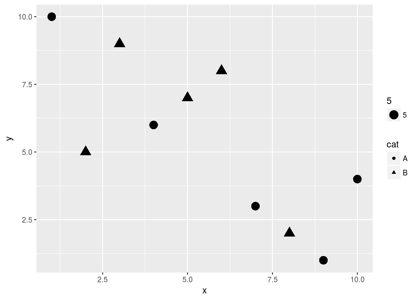
qplot(x, y, geom="point", size=5, shape=cat)
Colored groups
p <- qplot(x, y, geom="point", size=x, color=cat,
            main="Dot Size and Color Relative to Some Values") +
     theme(legend.position = "none")
print(p)
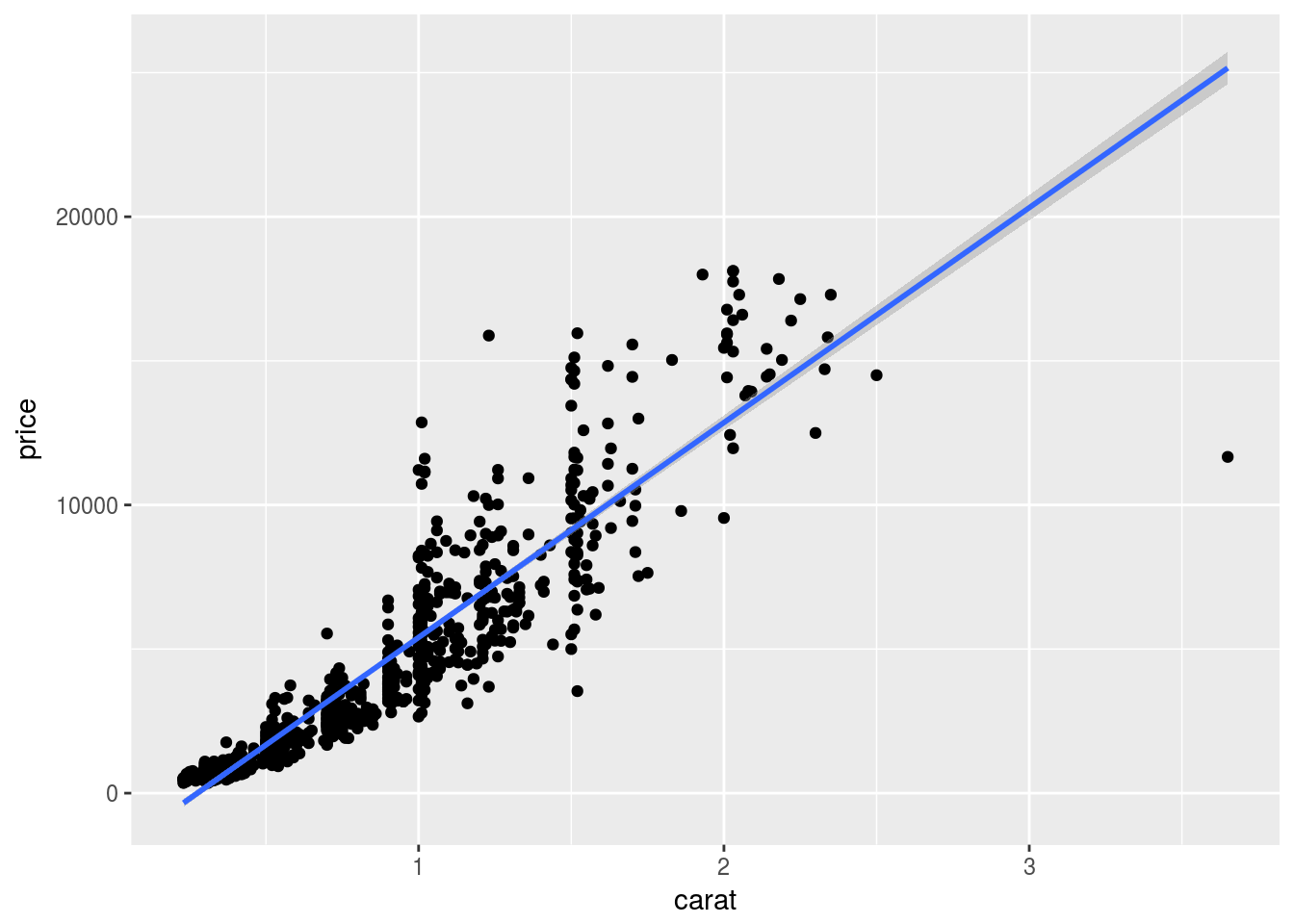
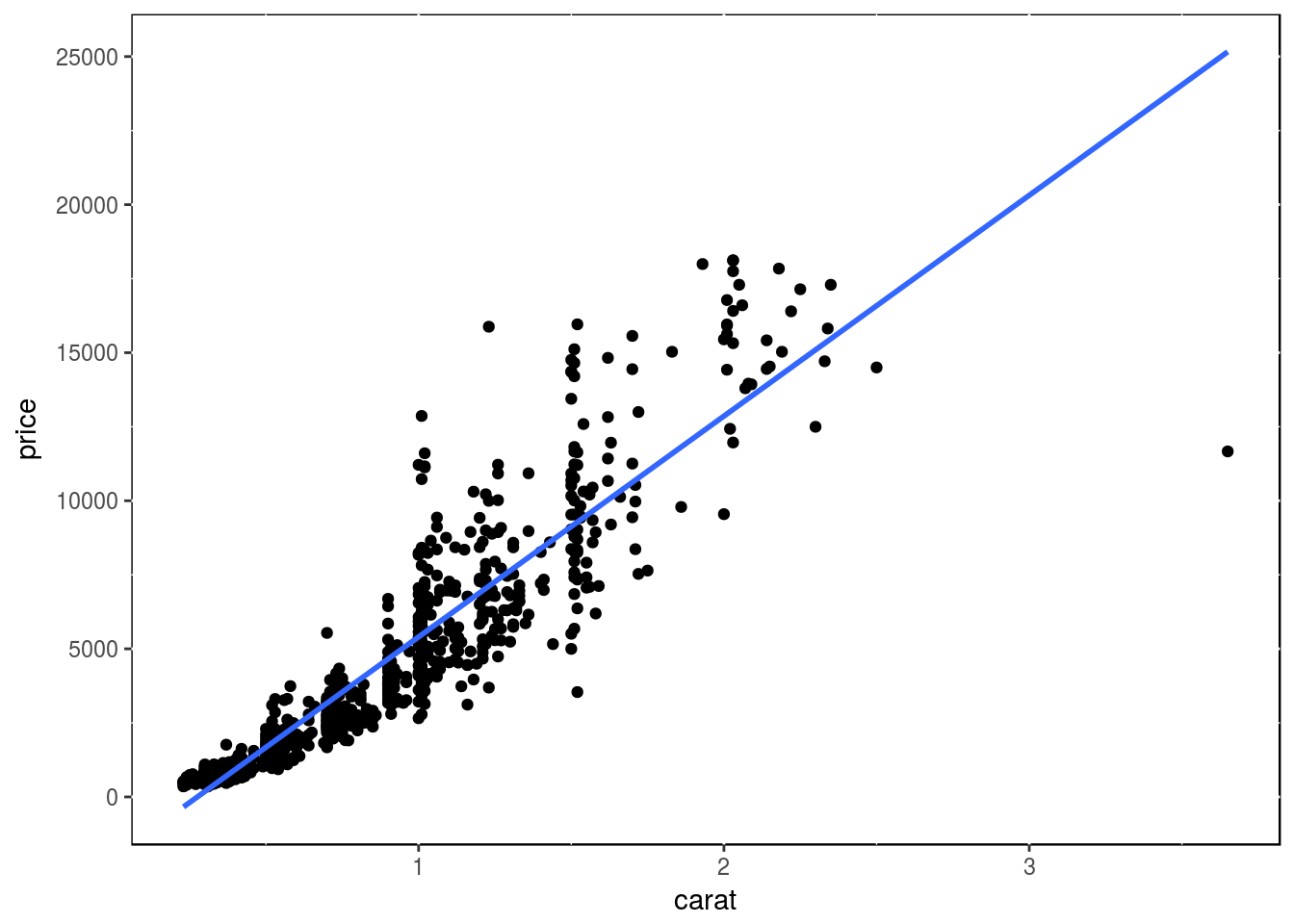
Regression line
set.seed(1410)
dsmall <- diamonds[sample(nrow(diamonds), 1000), ]
p <- qplot(carat, price, data = dsmall) +
           geom_smooth(method="lm")
print(p)
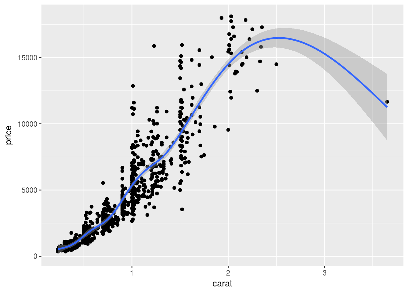
Local regression curve (loess)
p <- qplot(carat, price, data=dsmall, geom=c("point", "smooth"))
print(p) # Setting se=FALSE removes error shade
## `geom_smooth()` using method = 'gam'

ggplot Function
- More important than
qplotto access full functionality ofggplot2 - Main arguments
- data set, usually a
data.frameortibble - aesthetic mappings provided by
aesfunction
- data set, usually a
- General
ggplotsyntaxggplot(data, aes(...)) + geom() + ... + stat() + ...
- Layer specifications
geom(mapping, data, ..., geom, position)stat(mapping, data, ..., stat, position)
- Additional components
scalescoordinatesfacet
aes()mappings can be passed on to all components (ggplot, geom, etc.). Effects are global when passed on toggplot()and local for other components.x, ycolor: grouping vector (factor)group: grouping vector (factor)
Changing Plotting Themes in ggplot
- Theme settings can be accessed with
theme_get() - Their settings can be changed with
theme()
Example how to change background color to white
... + theme(panel.background=element_rect(fill = "white", colour = "black"))
Storing ggplot Specifications
Plots and layers can be stored in variables
p <- ggplot(dsmall, aes(carat, price)) + geom_point()
p # or print(p)
Returns information about data and aesthetic mappings followed by each layer
summary(p)
Print dots with different sizes and colors
bestfit <- geom_smooth(method = "lm", se = F, color = alpha("steelblue", 0.5), size = 2)
p + bestfit # Plot with custom regression line
Syntax to pass on other data sets
p %+% diamonds[sample(nrow(diamonds), 100),]
Saves plot stored in variable p to file
ggsave(p, file="myplot.pdf")
ggplot: scatter plots
Basic example
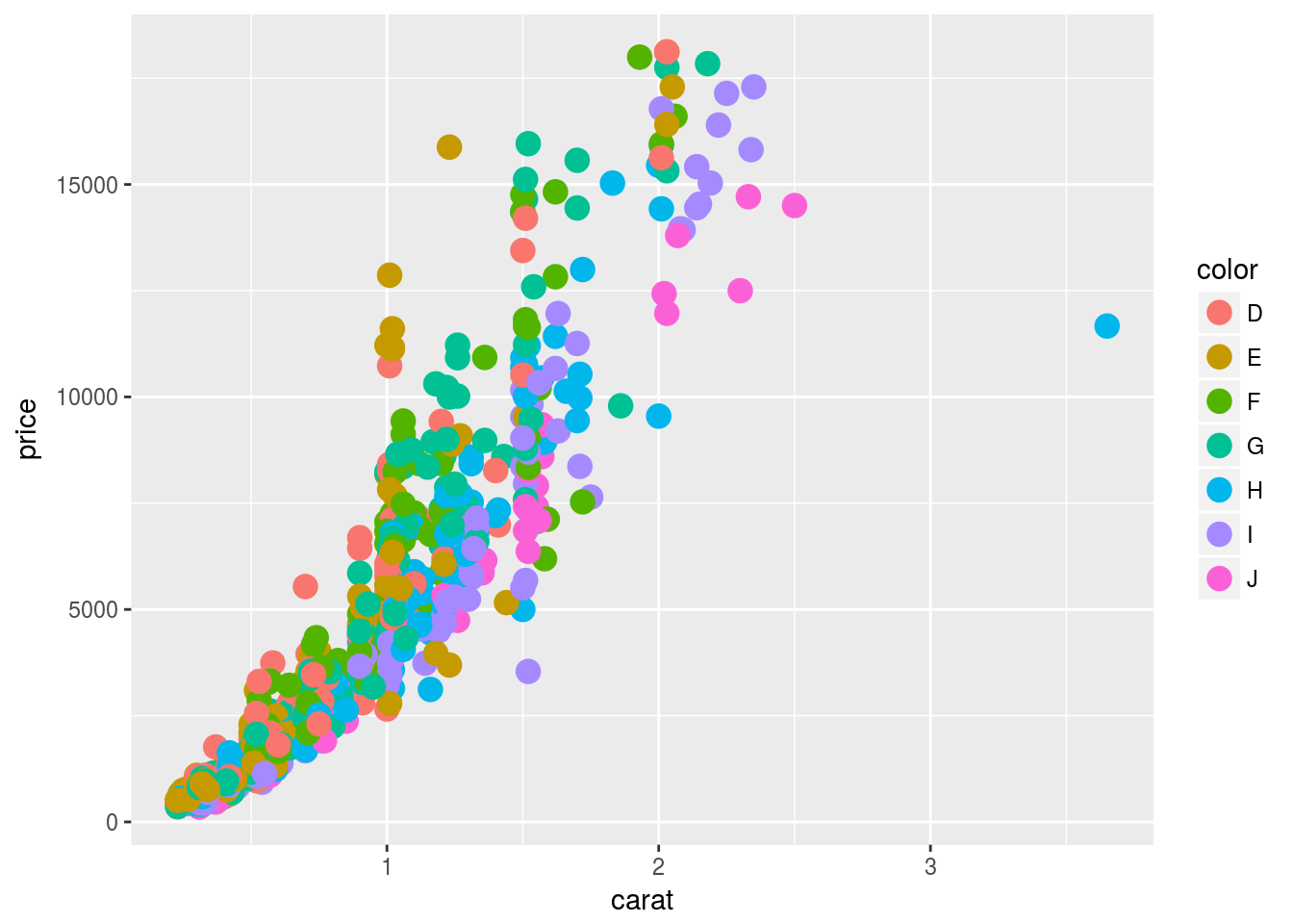
set.seed(1410)
dsmall <- as.data.frame(diamonds[sample(nrow(diamonds), 1000), ])
p <- ggplot(dsmall, aes(carat, price, color=color)) +
            geom_point(size=4)
print(p)
Regression line
p <- ggplot(dsmall, aes(carat, price)) + geom_point() +
            geom_smooth(method="lm", se=FALSE) +
    	    theme(panel.background=element_rect(fill = "white", colour = "black"))
print(p)
Several regression lines
p <- ggplot(dsmall, aes(carat, price, group=color)) +
            geom_point(aes(color=color), size=2) +
            geom_smooth(aes(color=color), method = "lm", se=FALSE)
print(p)

Local regression curve (loess)
p <- ggplot(dsmall, aes(carat, price)) + geom_point() + geom_smooth()
print(p) # Setting se=FALSE removes error shade
## `geom_smooth()` using method = 'gam'
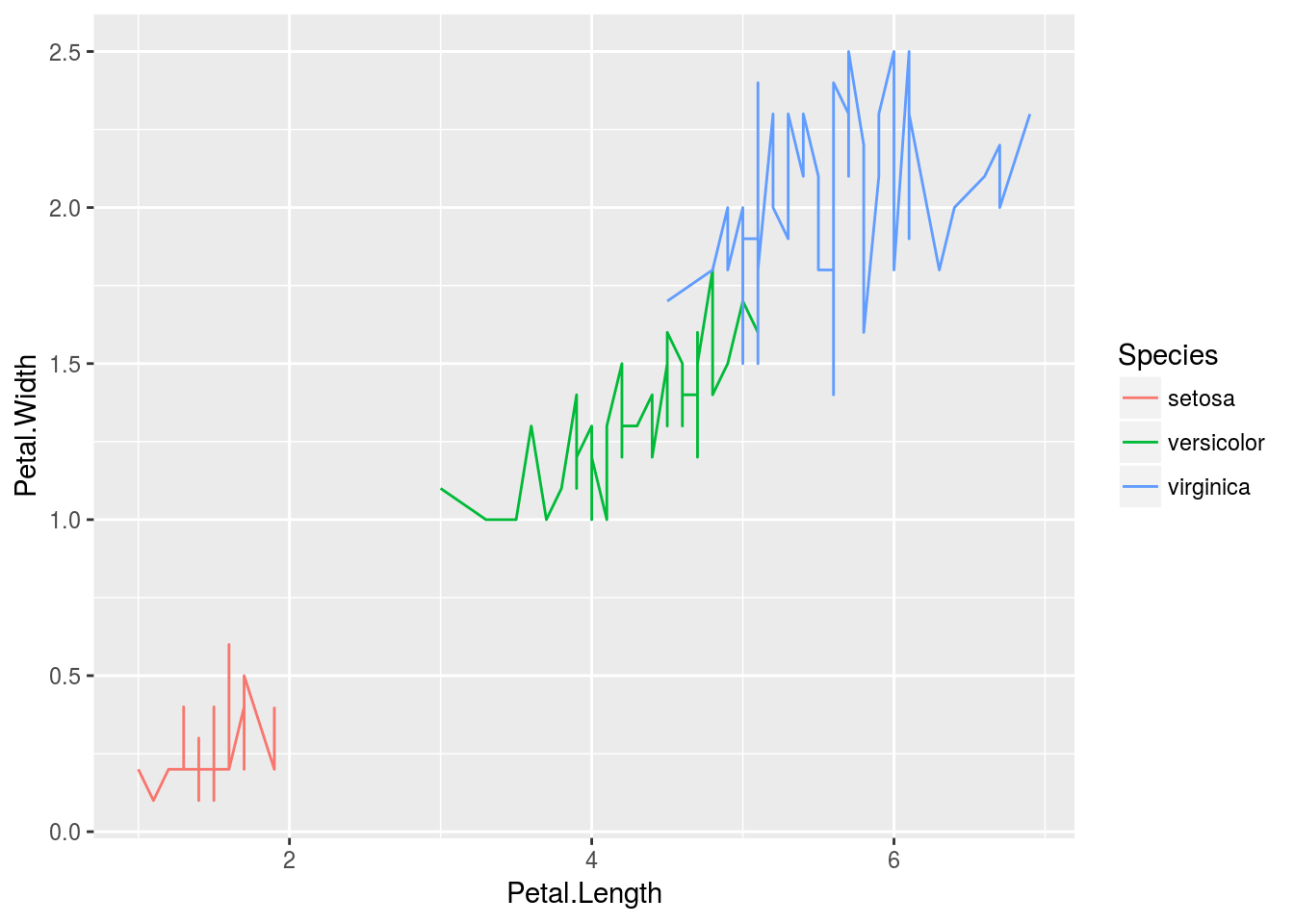
ggplot: line plot
p <- ggplot(iris, aes(Petal.Length, Petal.Width, group=Species,
            color=Species)) + geom_line()
print(p)
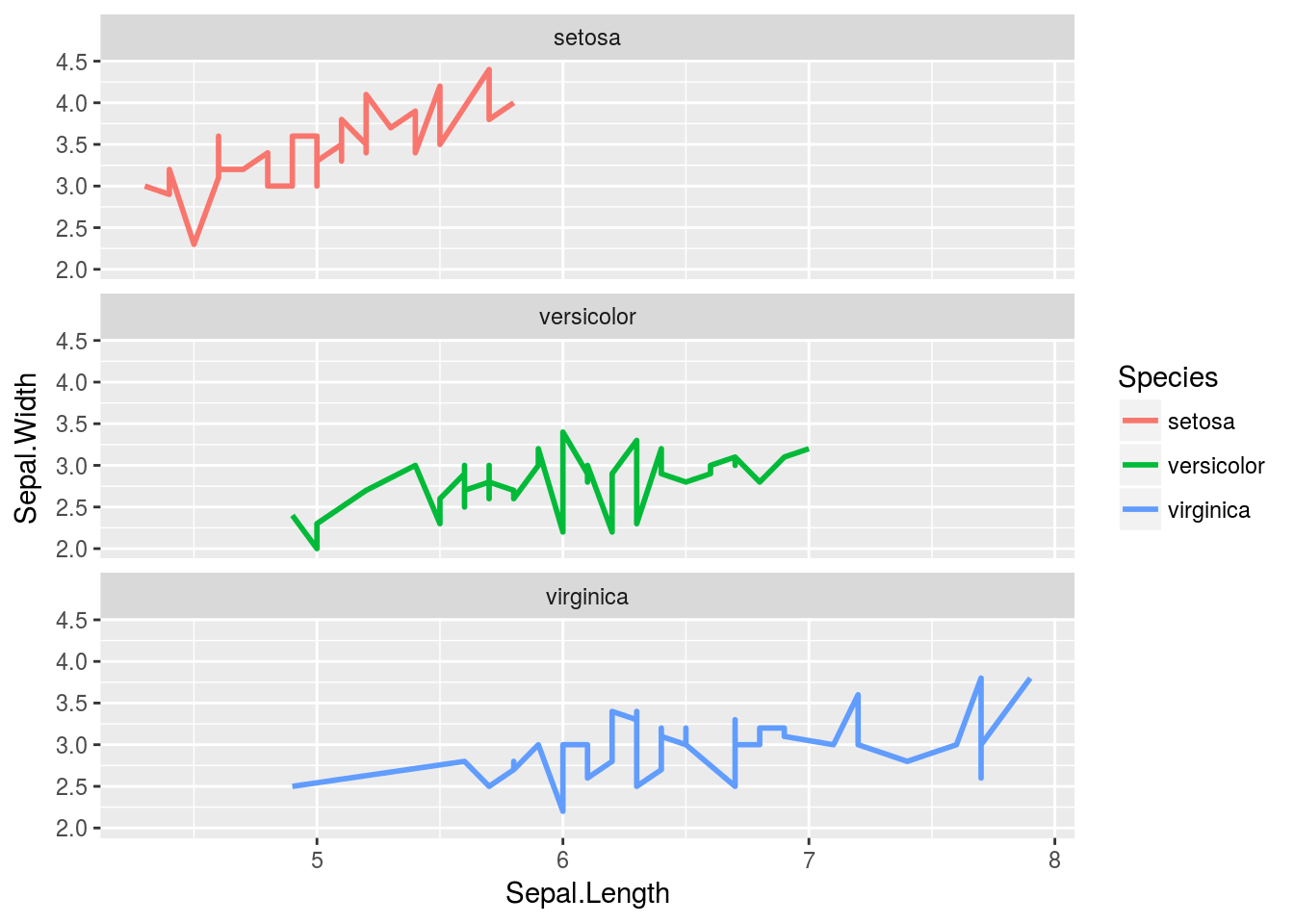
Faceting
p <- ggplot(iris, aes(Sepal.Length, Sepal.Width)) +
    	    geom_line(aes(color=Species), size=1) +
            facet_wrap(~Species, ncol=1)
print(p)
Exercise 3
Scatter plots with ggplot2
- Task 1: Generate scatter plot for first two columns in
irisdata frame and color dots by itsSpeciescolumn. - Task 2: Use the
xlimandylimarguments to set limits on the x- and y-axes so that all data points are restricted to the left bottom quadrant of the plot. - Task 3: Generate corresponding line plot with faceting show individual data sets in saparate plots.
Structure of iris data set
class(iris)
## [1] "data.frame"
iris[1:4,]
##   Sepal.Length Sepal.Width Petal.Length Petal.Width Species
## 1          5.1         3.5          1.4         0.2  setosa
## 2          4.9         3.0          1.4         0.2  setosa
## 3          4.7         3.2          1.3         0.2  setosa
## 4          4.6         3.1          1.5         0.2  setosa
table(iris$Species)
##
##     setosa versicolor  virginica
##         50         50         50
Bar Plots
Sample Set: the following transforms the iris data set into a ggplot2-friendly format.
Calculate mean values for aggregates given by Species column in iris data set
iris_mean <- aggregate(iris[,1:4], by=list(Species=iris$Species), FUN=mean)
Calculate standard deviations for aggregates given by Species column in iris data set
iris_sd <- aggregate(iris[,1:4], by=list(Species=iris$Species), FUN=sd)
Reformat iris_mean with melt
library(reshape2) # Defines melt function
df_mean <- melt(iris_mean, id.vars=c("Species"), variable.name = "Samples", value.name="Values")
Reformat iris_sd with melt
df_sd <- melt(iris_sd, id.vars=c("Species"), variable.name = "Samples", value.name="Values")
Define standard deviation limits
limits <- aes(ymax = df_mean[,"Values"] + df_sd[,"Values"], ymin=df_mean[,"Values"] - df_sd[,"Values"])
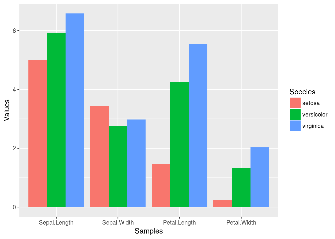
Verical orientation
p <- ggplot(df_mean, aes(Samples, Values, fill = Species)) +
	    geom_bar(position="dodge", stat="identity")
print(p)
To enforce that the bars are plotted in the order specified in the input data, one can instruct ggplot
to do so by turning the corresponding column (here Species) into an ordered factor as follows.
df_mean$Species <- factor(df_mean$Species, levels=unique(df_mean$Species), ordered=TRUE)
In the above example this is not necessary since ggplot uses this order already.
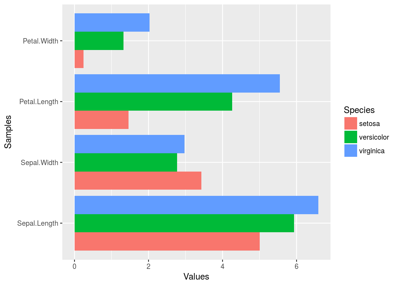
Horizontal orientation
p <- ggplot(df_mean, aes(Samples, Values, fill = Species)) +
            geom_bar(position="dodge", stat="identity") + coord_flip() +
            theme(axis.text.y=element_text(angle=0, hjust=1))
print(p)
Faceting
p <- ggplot(df_mean, aes(Samples, Values)) + geom_bar(aes(fill = Species), stat="identity") +
            facet_wrap(~Species, ncol=1)
print(p)
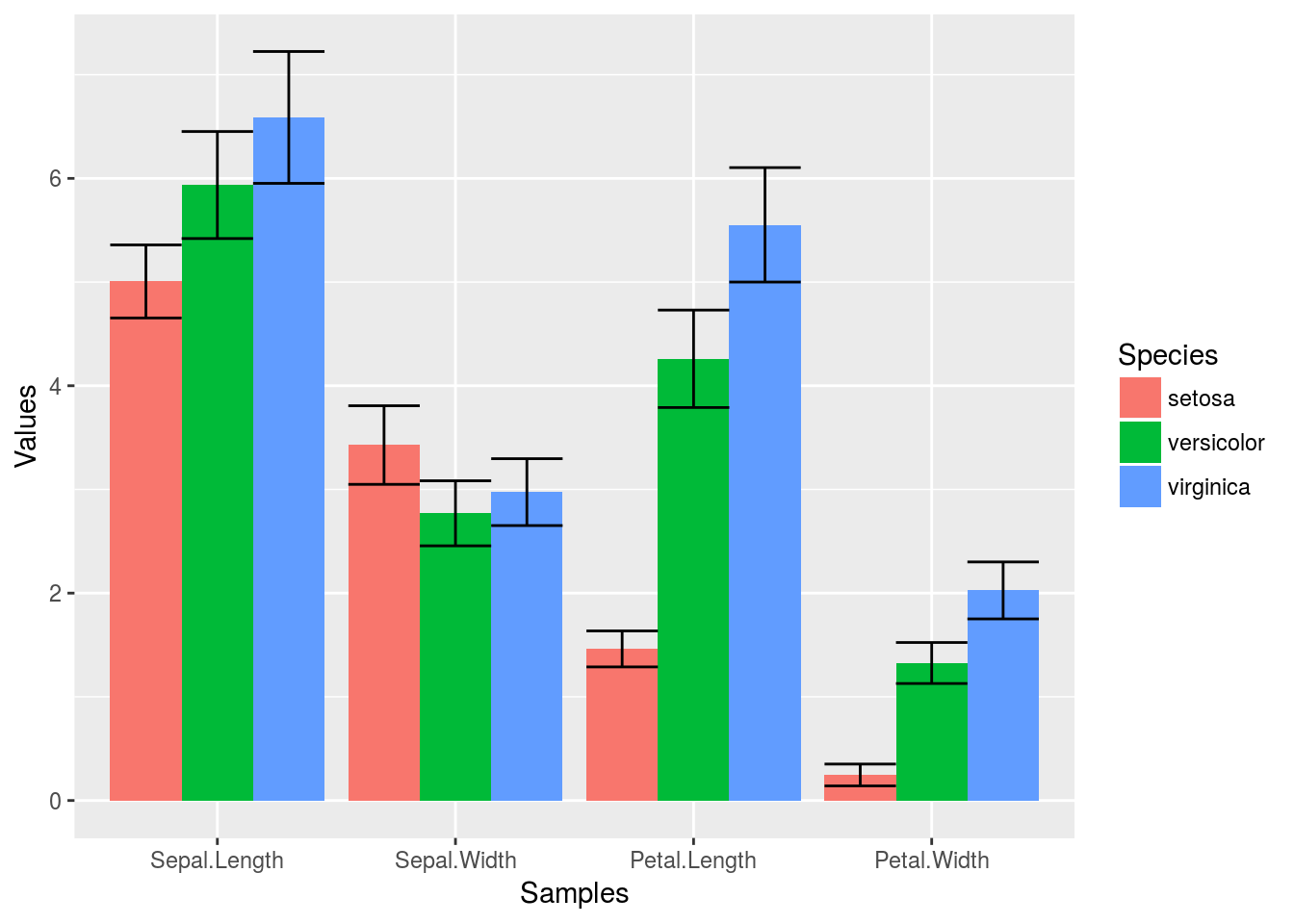
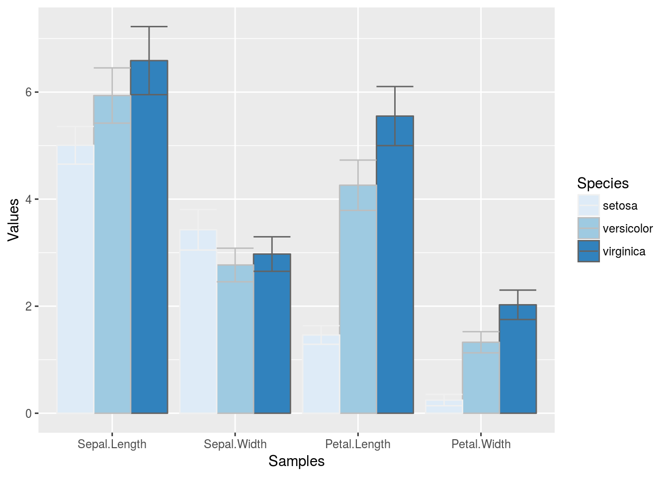
Error bars
p <- ggplot(df_mean, aes(Samples, Values, fill = Species)) +
	    geom_bar(position="dodge", stat="identity") + geom_errorbar(limits, position="dodge")
print(p)
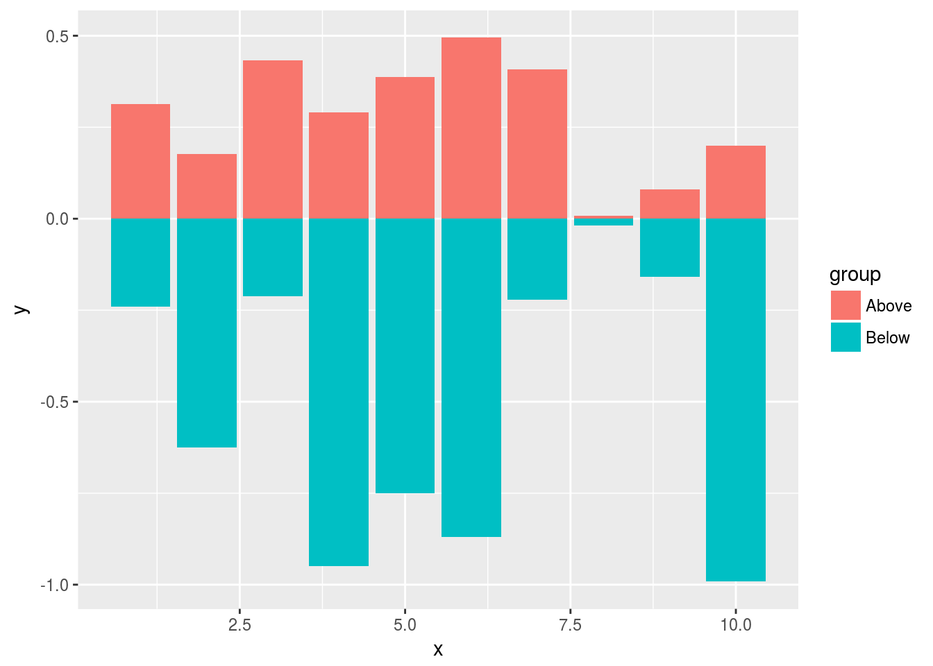
Mirrored
df <- data.frame(group = rep(c("Above", "Below"), each=10), x = rep(1:10, 2), y = c(runif(10, 0, 1), runif(10, -1, 0)))
p <- ggplot(df, aes(x=x, y=y, fill=group)) +
	    geom_bar(stat="identity", position="identity")
print(p)
Changing Color Settings
library(RColorBrewer)
# display.brewer.all()
p <- ggplot(df_mean, aes(Samples, Values, fill=Species, color=Species)) +
            geom_bar(position="dodge", stat="identity") + geom_errorbar(limits, position="dodge") +
            scale_fill_brewer(palette="Blues") + scale_color_brewer(palette = "Greys")
print(p)
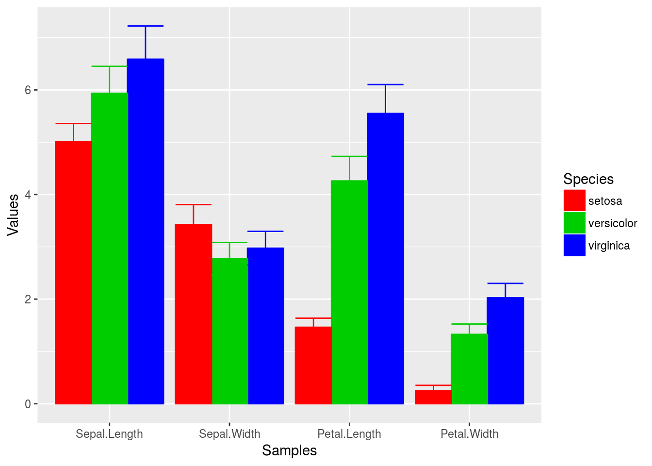
Using standard colors
p <- ggplot(df_mean, aes(Samples, Values, fill=Species, color=Species)) +
            geom_bar(position="dodge", stat="identity") + geom_errorbar(limits, position="dodge") +
            scale_fill_manual(values=c("red", "green3", "blue")) +
            scale_color_manual(values=c("red", "green3", "blue"))
print(p)
Exercise 4
Bar plots
- Task 1: Calculate the mean values for the
Speciescomponents of the first four columns in theirisdata set. Use themeltfunction from thereshape2package to bring the data into the expected format forggplot. - Task 2: Generate two bar plots: one with stacked bars and one with horizontally arranged bars.
Structure of iris data set
class(iris)
## [1] "data.frame"
iris[1:4,]
##   Sepal.Length Sepal.Width Petal.Length Petal.Width Species
## 1          5.1         3.5          1.4         0.2  setosa
## 2          4.9         3.0          1.4         0.2  setosa
## 3          4.7         3.2          1.3         0.2  setosa
## 4          4.6         3.1          1.5         0.2  setosa
table(iris$Species)
##
##     setosa versicolor  virginica
##         50         50         50
Data reformatting example
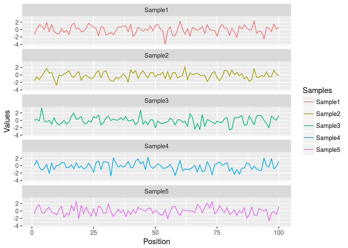
Here for line plot
y <- matrix(rnorm(500), 100, 5, dimnames=list(paste("g", 1:100, sep=""), paste("Sample", 1:5, sep="")))
y <- data.frame(Position=1:length(y[,1]), y)
y[1:4, ] # First rows of input format expected by melt()
##    Position    Sample1    Sample2     Sample3     Sample4    Sample5
## g1        1 -1.2024596 -1.5004962 -0.01111579  0.07584497 -0.7100662
## g2        2  0.1023678 -0.5153367  0.28564390  1.41522878  1.1084695
## g3        3  1.3294248 -1.2084007 -0.19581898 -0.42361768  1.7139697
## g4        4  0.9219004 -0.3471160  3.32380305 -1.23402917 -0.3985408
df <- melt(y, id.vars=c("Position"), variable.name = "Samples", value.name="Values")
p <- ggplot(df, aes(Position, Values)) + geom_line(aes(color=Samples)) + facet_wrap(~Samples, ncol=1)
print(p)
Same data can be represented in box plot as follows
ggplot(df, aes(Samples, Values, fill=Samples)) + geom_boxplot()
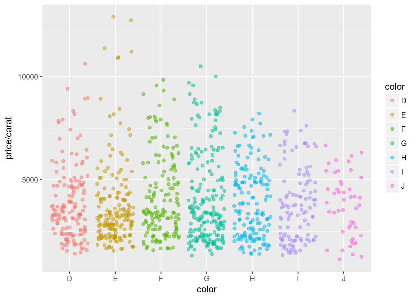
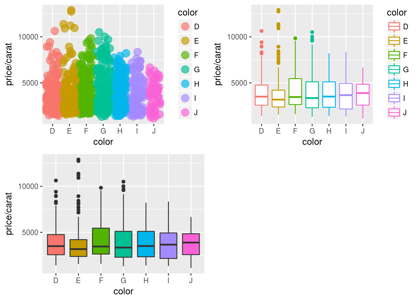
Jitter Plots
p <- ggplot(dsmall, aes(color, price/carat)) +
            geom_jitter(alpha = I(1 / 2), aes(color=color))
print(p)
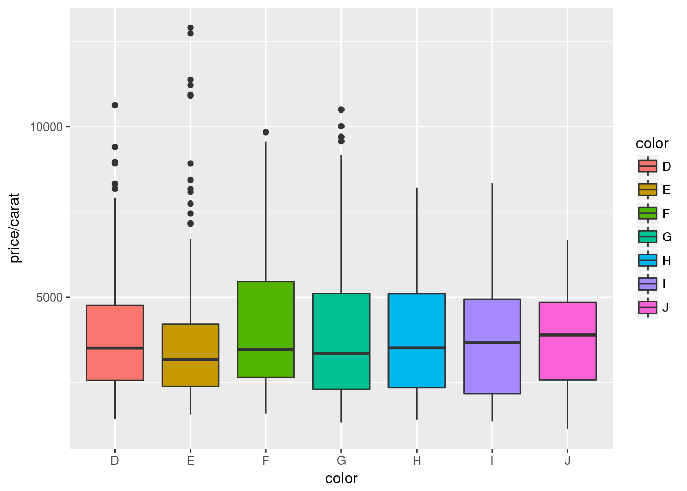
Box plots
p <- ggplot(dsmall, aes(color, price/carat, fill=color)) + geom_boxplot()
print(p)
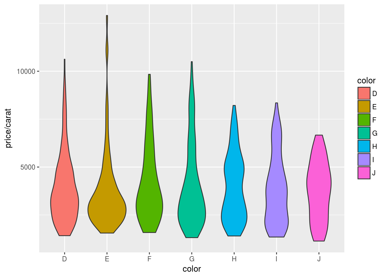
Violin plots
p <- ggplot(dsmall, aes(color, price/carat, fill=color)) + geom_violin()
print(p)
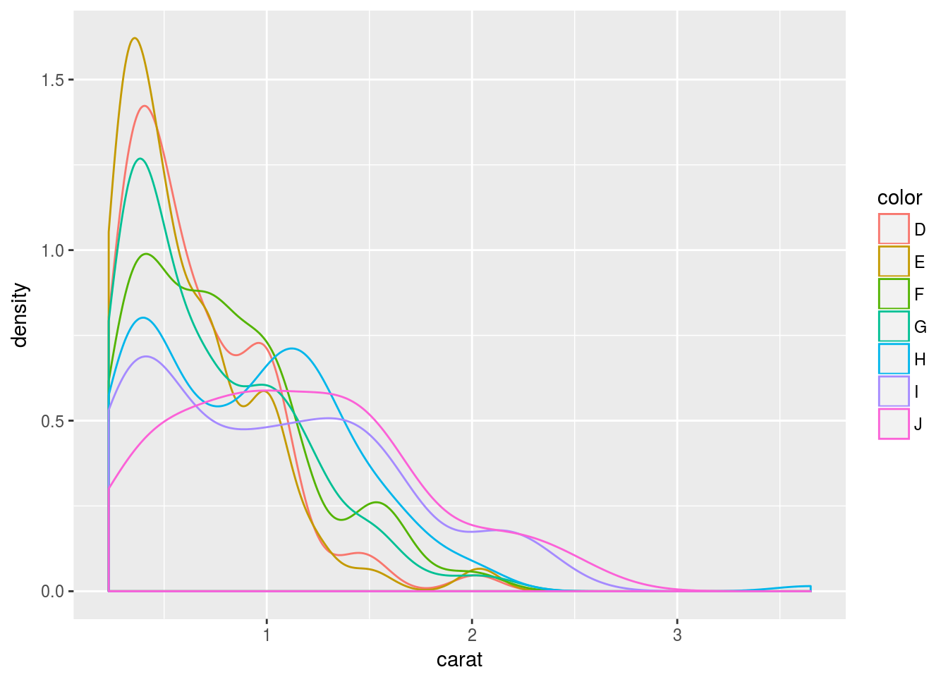
Density plots
Line coloring
p <- ggplot(dsmall, aes(carat)) + geom_density(aes(color = color))
print(p)
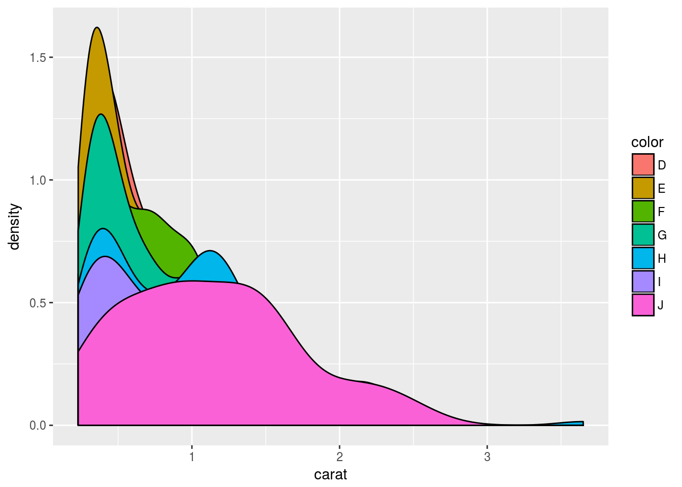
Area coloring
p <- ggplot(dsmall, aes(carat)) + geom_density(aes(fill = color))
print(p)
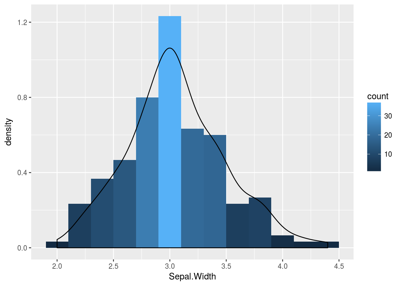
Histograms
p <- ggplot(iris, aes(x=Sepal.Width)) + geom_histogram(aes(y = ..density..,
            fill = ..count..), binwidth=0.2) + geom_density()
print(p)
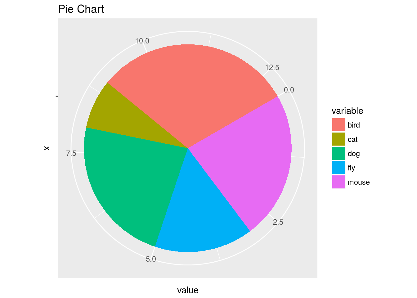
Pie Chart
df <- data.frame(variable=rep(c("cat", "mouse", "dog", "bird", "fly")),
                 value=c(1,3,3,4,2))
p <- ggplot(df, aes(x = "", y = value, fill = variable)) +
            geom_bar(width = 1, stat="identity") +
            coord_polar("y", start=pi / 3) + ggtitle("Pie Chart")
print(p)
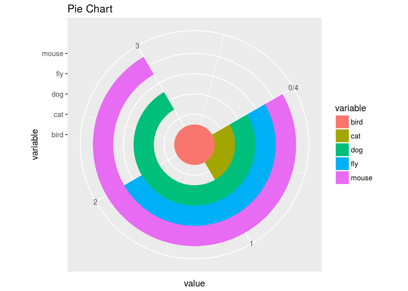
Wind Rose Pie Chart
p <- ggplot(df, aes(x = variable, y = value, fill = variable)) +
       geom_bar(width = 1, stat="identity") + coord_polar("y", start=pi / 3) +
       ggtitle("Pie Chart")
print(p)
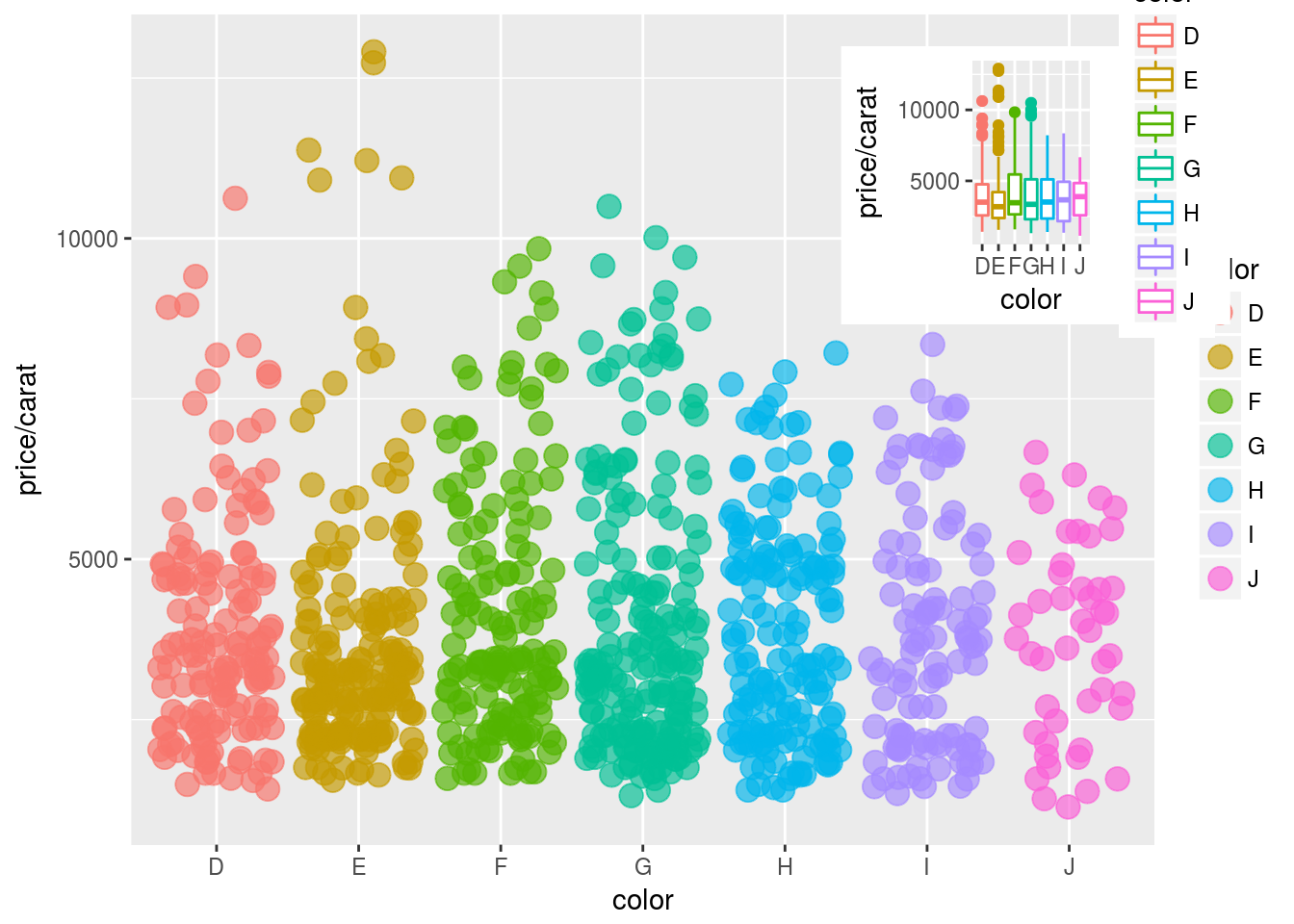
Arranging Graphics on Page
Using grid package
library(grid)
a <- ggplot(dsmall, aes(color, price/carat)) + geom_jitter(size=4, alpha = I(1 / 1.5), aes(color=color))
b <- ggplot(dsmall, aes(color, price/carat, color=color)) + geom_boxplot()
c <- ggplot(dsmall, aes(color, price/carat, fill=color)) + geom_boxplot() + theme(legend.position = "none")
grid.newpage() # Open a new page on grid device
pushViewport(viewport(layout = grid.layout(2, 2))) # Assign to device viewport with 2 by 2 grid layout
print(a, vp = viewport(layout.pos.row = 1, layout.pos.col = 1:2))
print(b, vp = viewport(layout.pos.row = 2, layout.pos.col = 1))
print(c, vp = viewport(layout.pos.row = 2, layout.pos.col = 2, width=0.3, height=0.3, x=0.8, y=0.8))

Using gridExtra package
library(gridExtra)
grid.arrange(a, b, c, nrow = 2, ncol=2)
Inserting Graphics into Plots
library(grid)
print(a)
print(b, vp=viewport(width=0.3, height=0.3, x=0.8, y=0.8))