Overview
- Important high-level plotting functions
plot: generic x-y plottingbarplot: bar plotsboxplot: box-and-whisker plothist: histogramspie: pie chartsdotchart: cleveland dot plotsimage, heatmap, contour, persp: functions to generate image-like plotsqqnorm, qqline, qqplot: distribution comparison plotspairs, coplot: display of multivariant data
- Help on these functions
?myfct</span></span>?plot</span></span>?par</span></span>
Preferred Input Data Objects
- Matrices and data frames
- Vectors
- Named vectors
Scatter Plots
Basic scatter plots
Sample data set for subsequent plots
set.seed(1410)
y <- matrix(runif(30), ncol=3, dimnames=list(letters[1:10], LETTERS[1:3]))
plot(y[,1], y[,2]) 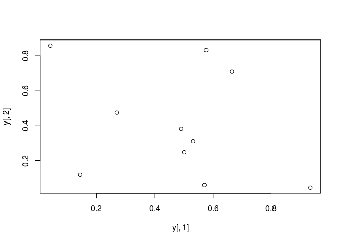
All pairs
pairs(y) 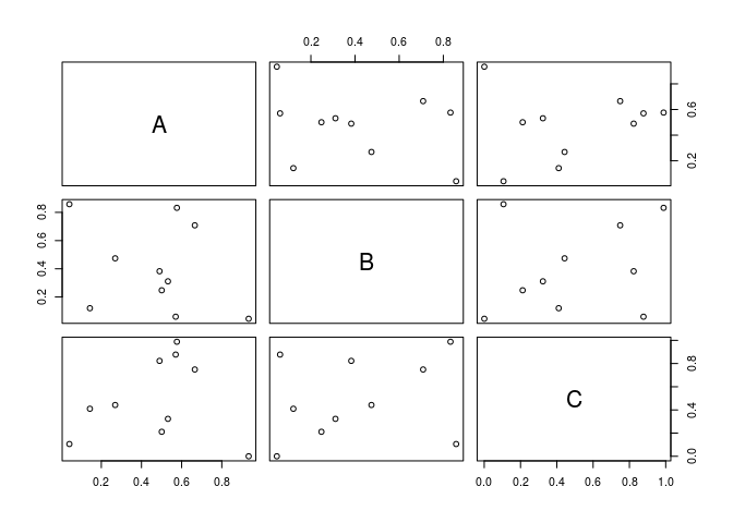
Plot labels
plot(y[,1], y[,2], pch=20, col="red", main="Symbols and Labels")
text(y[,1]+0.03, y[,2], rownames(y))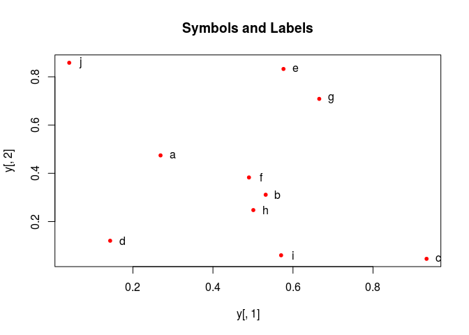
More examples
Print instead of symbols the row names
plot(y[,1], y[,2], type="n", main="Plot of Labels")
text(y[,1], y[,2], rownames(y))
Usage of important plotting parameters
grid(5, 5, lwd = 2)
op <- par(mar=c(8,8,8,8), bg="lightblue")
plot(y[,1], y[,2], type="p", col="red", cex.lab=1.2, cex.axis=1.2,
     cex.main=1.2, cex.sub=1, lwd=4, pch=20, xlab="x label",
     ylab="y label", main="My Main", sub="My Sub")
par(op)
Important arguments}
- mar: specifies the margin sizes around the plotting area in order: c(bottom, left, top, right)
- col: color of symbols
- pch: type of symbols, samples: example(points)
- lwd: size of symbols
- cex.*: control font sizes
- For details see ?par
Add a regression line to a plot
plot(y[,1], y[,2])
myline <- lm(y[,2]~y[,1]); abline(myline, lwd=2) 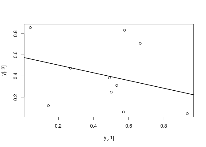
summary(myline) ##
## Call:
## lm(formula = y[, 2] ~ y[, 1])
##
## Residuals:
## Min 1Q Median 3Q Max
## -0.40357 -0.17912 -0.04299 0.22147 0.46623
##
## Coefficients:
## Estimate Std. Error t value Pr(>|t|)
## (Intercept) 0.5764 0.2110 2.732 0.0258 *
## y[, 1] -0.3647 0.3959 -0.921 0.3839
## ---
## Signif. codes: 0 '***' 0.001 '**' 0.01 '*' 0.05 '.' 0.1 ' ' 1
##
## Residual standard error: 0.3095 on 8 degrees of freedom
## Multiple R-squared: 0.09589, Adjusted R-squared: -0.01712
## F-statistic: 0.8485 on 1 and 8 DF, p-value: 0.3839Same plot as above, but on log scale
plot(y[,1], y[,2], log="xy") 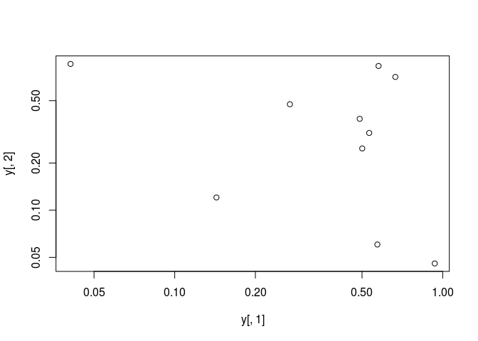
Add a mathematical expression to a plot
plot(y[,1], y[,2]); text(y[1,1], y[1,2],
expression(sum(frac(1,sqrt(x^2*pi)))), cex=1.3) 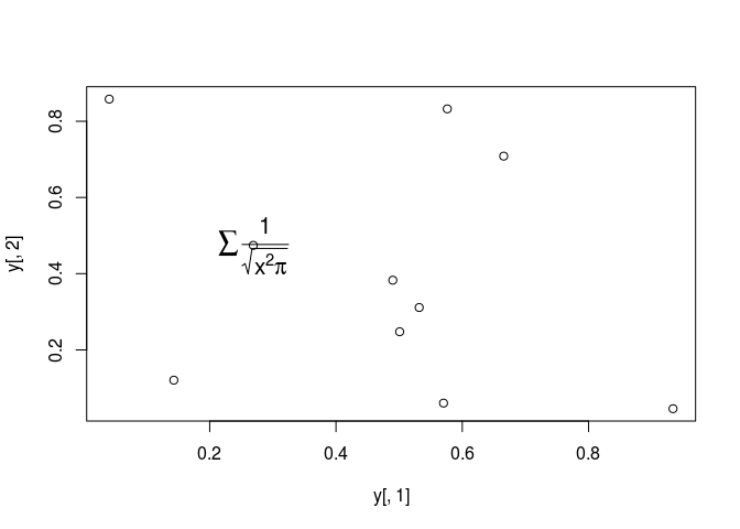
Exercise 1
- Task 1: Generate scatter plot for first two columns in
irisdata frame and color dots by itsSpeciescolumn. - Task 2: Use the
xlim/ylimarguments to set limits on the x- and y-axes so that all data points are restricted to the left bottom quadrant of the plot.
Structure of iris data set:
class(iris)## [1] "data.frame"iris[1:4,]## Sepal.Length Sepal.Width Petal.Length Petal.Width Species
## 1 5.1 3.5 1.4 0.2 setosa
## 2 4.9 3.0 1.4 0.2 setosa
## 3 4.7 3.2 1.3 0.2 setosa
## 4 4.6 3.1 1.5 0.2 setosatable(iris$Species)##
## setosa versicolor virginica
## 50 50 50Line Plots
Single Data Set
plot(y[,1], type="l", lwd=2, col="blue") 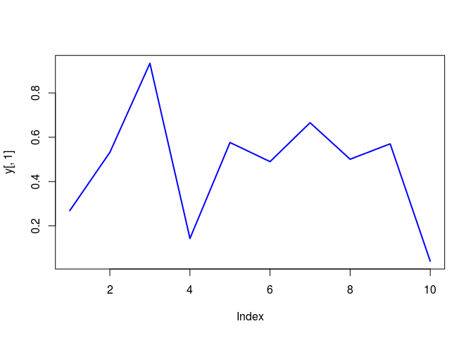
Many Data Sets
Plots line graph for all columns in data frame y. The split.screen function is used in this example in a for loop to overlay several line graphs in the same plot.
split.screen(c(1,1)) ## [1] 1plot(y[,1], ylim=c(0,1), xlab="Measurement", ylab="Intensity", type="l", lwd=2, col=1)
for(i in 2:length(y[1,])) {
screen(1, new=FALSE)
plot(y[,i], ylim=c(0,1), type="l", lwd=2, col=i, xaxt="n", yaxt="n", ylab="",
xlab="", main="", bty="n")
}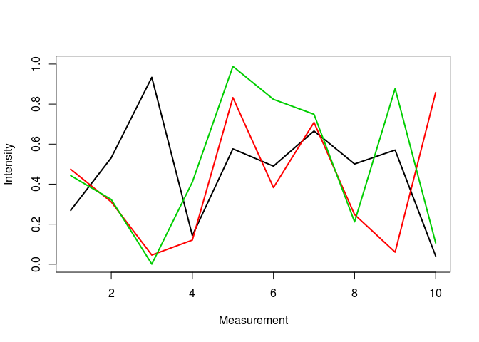
close.screen(all=TRUE) Bar Plots
Basics
barplot(y[1:4,], ylim=c(0, max(y[1:4,])+0.3), beside=TRUE,
        legend=letters[1:4])
text(labels=round(as.vector(as.matrix(y[1:4,])),2), x=seq(1.5, 13, by=1)
+sort(rep(c(0,1,2), 4)), y=as.vector(as.matrix(y[1:4,]))+0.04) 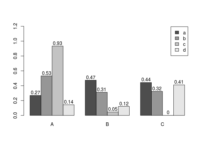
Error bars
bar <- barplot(m <- rowMeans(y) * 10, ylim=c(0, 10))
stdev <- sd(t(y))
arrows(bar, m, bar, m + stdev, length=0.15, angle = 90)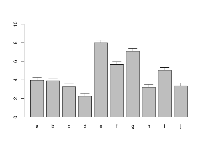
Mirrored bar plot
df <- data.frame(group = rep(c("Above", "Below"), each=10), x = rep(1:10, 2), y = c(runif(10, 0, 1), runif(10, -1, 0)))
plot(c(0,12),range(df$y),type = "n")
barplot(height = df$y[df$group == "Above"], add = TRUE,axes = FALSE)
barplot(height = df$y[df$group == "Below"], add = TRUE,axes = FALSE)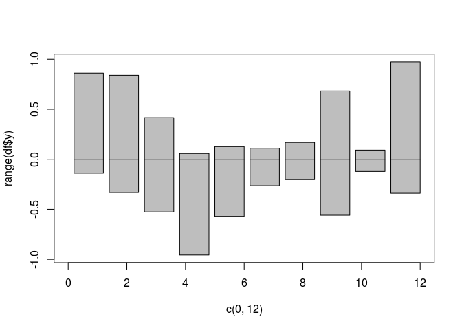
Histograms
hist(y, freq=TRUE, breaks=10)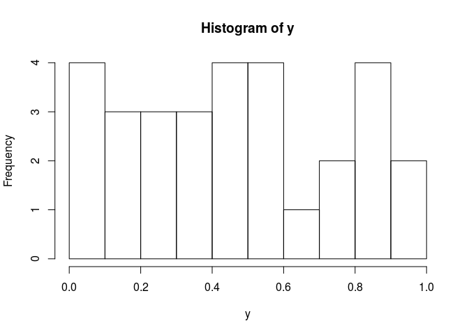
Density Plots}
plot(density(y), col="red")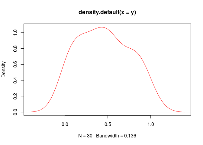
Pie Charts
pie(y[,1], col=rainbow(length(y[,1]), start=0.1, end=0.8), clockwise=TRUE)
legend("topright", legend=row.names(y), cex=1.3, bty="n", pch=15, pt.cex=1.8,
col=rainbow(length(y[,1]), start=0.1, end=0.8), ncol=1) 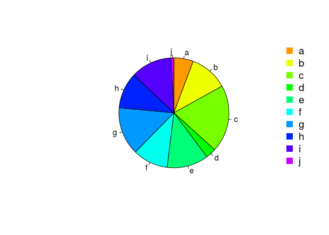
Color Selection Utilities
Default color palette and how to change it
palette()## [1] "black" "red" "green3" "blue" "cyan" "magenta" "yellow" "gray"palette(rainbow(5, start=0.1, end=0.2))
palette()## [1] "#FF9900" "#FFBF00" "#FFE600" "#F2FF00" "#CCFF00"palette("default")The gray function allows to select any type of gray shades by providing values from 0 to 1
gray(seq(0.1, 1, by= 0.2))## [1] "#1A1A1A" "#4D4D4D" "#808080" "#B3B3B3" "#E6E6E6"Color gradients with colorpanel function from gplots library
library(gplots)
colorpanel(5, "darkblue", "yellow", "white")
Much more on colors in R see Earl Glynn’s color chart
Arranging Several Plots on Single Page
With par(mfrow=c(nrow,ncol)) one can define how several plots are arranged next to each other.
par(mfrow=c(2,3)); for(i in 1:6) { plot(1:10) } 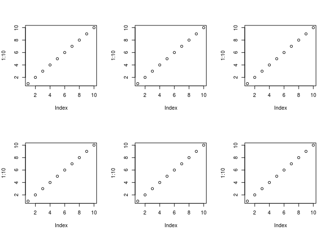
Arranging Plots with Variable Width
The layout function allows to divide the plotting device into variable numbers of rows and columns with the column-widths and the row-heights specified in the respective arguments.
nf <- layout(matrix(c(1,2,3,3), 2, 2, byrow=TRUE), c(3,7), c(5,5),
             respect=TRUE)
# layout.show(nf)
for(i in 1:3) { barplot(1:10) } 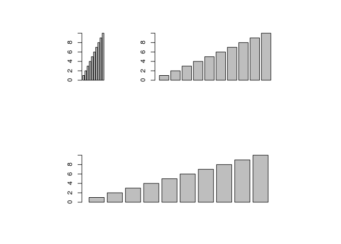
Saving Graphics to Files
After the pdf() command all graphs are redirected to file test.pdf. Works for all common formats similarly: jpeg, png, ps, tiff, …
pdf("test.pdf"); plot(1:10, 1:10); dev.off() Generates Scalable Vector Graphics (SVG) files that can be edited in vector graphics programs, such as InkScape.
svg("test.svg"); plot(1:10, 1:10); dev.off() Exercise 2
Bar plots
- Task 1: Calculate the mean values for the \Rfunction{Species} components of the first four columns in the \Rfunction{iris} data set. Organize the results in a matrix where the row names are the unique values from the \Rfunction{iris Species} column and the column names are the same as in the first four \Rfunction{iris} columns.
- Task 2: Generate two bar plots: one with stacked bars and one with horizontally arranged bars.
Structure of iris data set:
class(iris)## [1] "data.frame"iris[1:4,]## Sepal.Length Sepal.Width Petal.Length Petal.Width Species
## 1 5.1 3.5 1.4 0.2 setosa
## 2 4.9 3.0 1.4 0.2 setosa
## 3 4.7 3.2 1.3 0.2 setosa
## 4 4.6 3.1 1.5 0.2 setosatable(iris$Species)##
## setosa versicolor virginica
## 50 50 50